Picture walking into a dining room where the walls seem to breathe with tranquility, where every meal feels like a retreat from the everyday chaos. Blue possesses this remarkable power—it can whisper serenity through soft powder hues or command attention with dramatic navy depths. This isn’t just about choosing a paint color; it’s about orchestrating an entire emotional experience around your dining table.
The magic of a blue dining room lies in its incredible versatility. From the sun-kissed calm of coastal blues that make small spaces feel expansive, to the jewel-toned richness of sapphire that transforms ordinary dinners into elegant affairs, blue adapts to your lifestyle and aspirations. Yet with such endless possibilities comes the challenge of making the right choices—which shade will complement your natural light? How do you prevent cool tones from feeling stark? What textures and materials will create the perfect balance?
These 18 carefully curated ideas will guide you through every decision, from foundational elements like wall color and flooring to the finishing touches that make your space uniquely yours. Whether you’re dreaming of intimate dinner parties or lively family gatherings, your perfect blue dining room awaits.
1. Choose Your Perfect Blue Foundation
The foundation shade you select sets the emotional temperature for every meal shared in your space. Cool undertones like those found in powder blue or periwinkle create an atmosphere of calm reflection, perfect for leisurely weekend brunches where conversation flows as freely as the morning light. Warmer blues with hints of green, such as teal or turquoise, energize the space while maintaining sophistication, encouraging more animated dinner conversations and festive gatherings.
Testing your chosen shade is crucial—what appears serene on a paint chip might feel overwhelming on four walls. Paint large swatches in different areas of your room and observe them throughout the day. Morning light reveals cool undertones, while evening illumination brings out warmer depths. Consider how your blue will interact with existing elements: does your dining table’s wood tone lean warm or cool? Will your lighting fixtures complement or compete with your chosen hue?
- Light blues (powder, sky, robin’s egg): Create spaciousness and calm
- Medium blues (cornflower, cerulean, slate): Offer versatility and balance
- Deep blues (navy, indigo, midnight): Provide drama and intimacy
Look closely and you’ll notice the subtle texture of how different blues interact with your room’s architecture…
2. Layer Multiple Blue Tones for Depth
Rather than committing to a single blue throughout your dining space, layering various shades creates visual richness that prevents monotony while maintaining color harmony. Start with your dominant tone on the walls, then introduce lighter versions through textiles like table runners or chair cushions, and deeper shades through artwork or decorative accessories. This approach mimics the natural variation found in water and sky, creating an organic, sophisticated palette.
The key to successful blue layering lies in maintaining enough contrast between shades to create definition while ensuring they share similar undertones. A room anchored by slate blue walls might feature navy dining chairs and powder blue ceramic serving pieces, creating a cohesive yet dynamic environment. This technique works particularly well in open-concept spaces where your blue dining room needs to flow seamlessly with adjacent areas.
- Dominant shade: Walls or large furniture pieces (60% of color scheme)
- Supporting tones: Upholstery, rugs, window treatments (30% of color scheme)
- Accent blues: Artwork, ceramics, decorative objects (10% of color scheme)
The magic of this piece lies in its ability to transform throughout the day as natural light shifts…
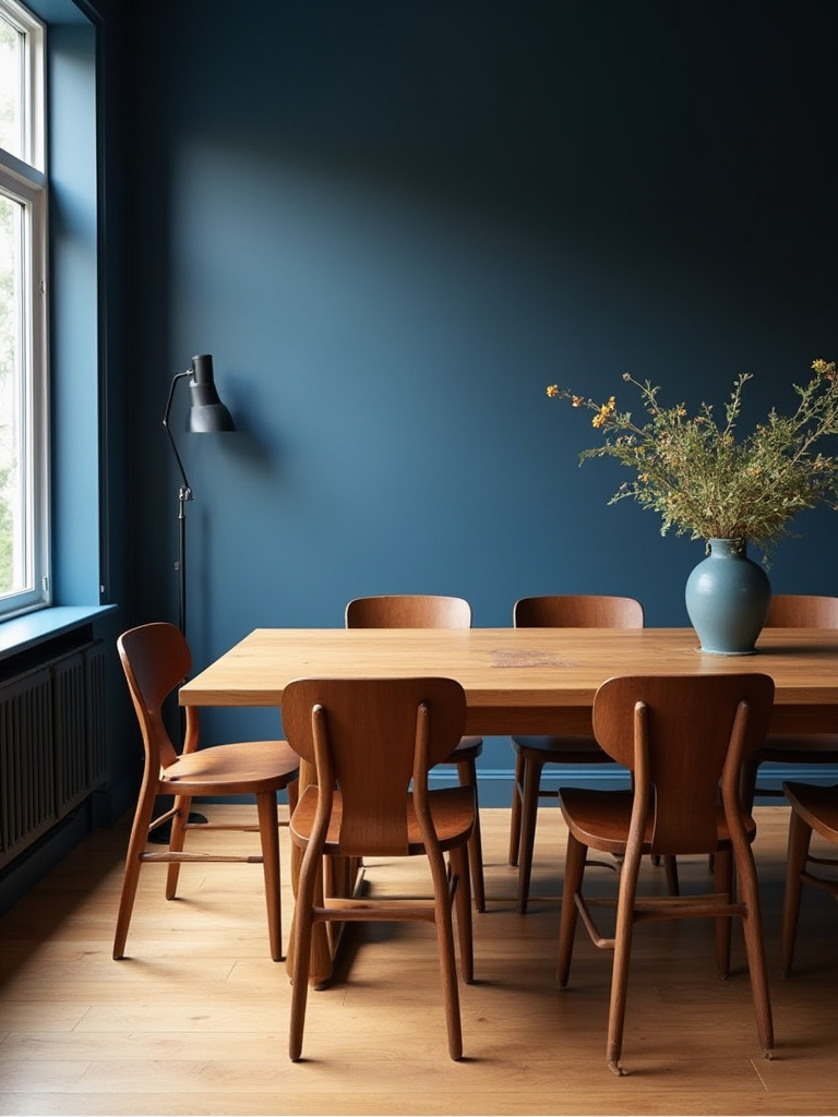
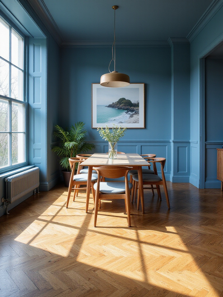
3. Balance Cool Blues with Warm Wood Elements
Wood introduces essential warmth that prevents your blue dining room from feeling clinical or unwelcoming. The organic grain patterns and honey tones of natural wood create a beautiful counterpoint to blue’s inherent coolness, establishing a space that feels both sophisticated and approachable. Consider how different wood species interact with your chosen blue—rich walnut adds drama against navy walls, while light oak brightens powder blue spaces.
Beyond the dining table, incorporate wood through floating shelves displaying ceramic pieces, a reclaimed wood Accent wall, or even ceiling beams if your architecture allows. The texture variation between smooth painted walls and natural wood grain adds tactile interest that makes the space feel more complete and lived-in. This combination has roots in traditional Scandinavian design, where blue and natural wood create spaces that feel both cozy and refined.
- Light woods (oak, maple, pine): Brighten darker blues and add casual warmth
- Medium woods (cherry, birch): Complement most blue tones with balanced warmth
- Dark woods (walnut, mahogany): Create dramatic contrast with lighter blues
The craftsmanship reveals itself in details like the way morning light catches both the wood grain and blue walls…
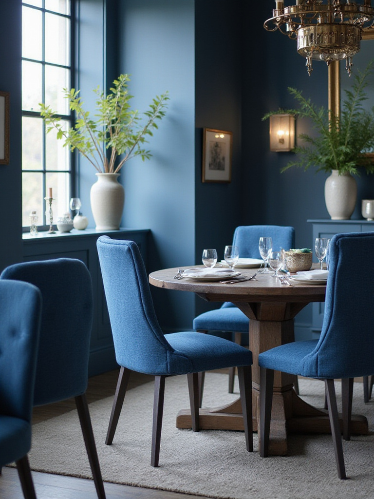
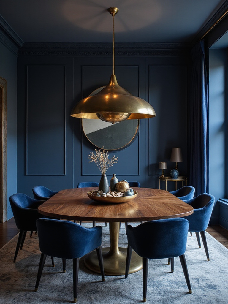
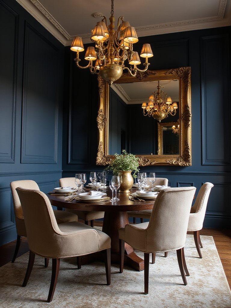
4. Create Contrast with Complementary Metallics
Metallic accents serve as jewelry for your blue dining room, adding sparkle and sophistication while bridging different design elements. Warm metals like brass and copper create stunning contrast against cool blues, while silver and chrome maintain the space’s cool temperature for a more modern aesthetic. The reflective quality of metals also bounces light around the room, making blues appear more vibrant and the space feel larger.
Consider incorporating metallics through light fixtures, cabinet hardware, picture frames, and serving pieces. A brass chandelier against navy walls creates instant drama, while copper planters filled with greenery add warmth and life. The key is choosing one primary metal and using it consistently throughout the space, with perhaps a secondary metal in smaller doses for added interest.
- Brass/Gold: Creates warmth and luxury against any blue tone
- Copper: Adds rustic elegance and works beautifully with deeper blues
- Silver/Chrome: Maintains cool sophistication in contemporary spaces
What makes this design special is the way metallic elements catch and reflect both natural and artificial light…
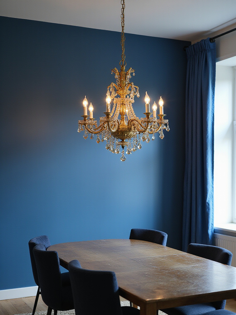
5. Anchor Your Space with Strategic Lighting
Lighting transforms your blue dining room from merely functional to truly atmospheric, allowing you to adjust the mood from bright family meals to intimate dinner parties. Layer three types of lighting: ambient (general illumination), task (focused light for dining), and accent (highlighting artwork or architectural features). Dimmable fixtures give you complete control over the ambiance, essential since blue can appear dramatically different under various lighting conditions.
Consider the color temperature of your bulbs carefully—warm white (2700K-3000K) enhances the cozy feeling in deeper blues, while cooler temperatures can make lighter blues feel crisp and fresh. A statement chandelier serves as both functional lighting and artistic focal point, while Wall sconces provide gentle ambient light that prevents harsh shadows during evening meals.
“Lighting is the soul of a room—it can make or break the entire design, especially with a color as nuanced as blue.” – Interior Designer Sarah Richardson
The interplay between the colors creates different moods as you adjust lighting throughout the evening…
6. Select Upholstery That Enhances Your Blue Palette
Your dining chair upholstery offers an opportunity to introduce texture, pattern, and complementary colors that enhance your blue scheme. Neutral fabrics like cream linen or warm gray velvet allow blue walls to take center stage while adding softness and comfort. Alternatively, patterned fabrics incorporating multiple blues can create visual interest while maintaining color harmony throughout the space.
Consider the practical aspects of your fabric choice—dining areas require materials that can withstand spills and frequent cleaning. Performance fabrics now come in luxurious textures that rival traditional options while offering superior stain resistance. The texture of your upholstery also affects the room’s overall feel: smooth leather creates a more formal atmosphere, while nubby linen suggests casual elegance.
- Neutral upholstery: Allows blue walls to dominate while adding comfort
- Patterned fabrics: Introduce visual interest through coordinating blues
- Textured materials: Add tactile appeal and prevent visual flatness
For those worried about maintenance, today’s performance fabrics offer both beauty and practicality…
7. Ground Your Design with Thoughtful Flooring Choices
Flooring provides the foundation that either supports or undermines your blue dining room design. Natural materials like hardwood in warm tones create beautiful contrast against cool blue walls, while natural stone adds texture and permanence. The key is selecting materials that complement rather than compete with your blue palette—avoid flooring with strong cool undertones that might make the space feel too cold.
Consider how your flooring choice affects the room’s acoustics as well as its appearance. Hard surfaces like tile or hardwood can create echo in dining spaces, which might require the addition of area rugs or soft furnishings to absorb sound. The scale and pattern of your flooring also influences the room’s perceived size—larger format tiles or wide-plank wood can make smaller dining rooms feel more spacious.
- Warm hardwood: Creates beautiful contrast and adds natural texture
- Natural stone: Provides permanence and works well with traditional blues
- Area rugs: Define the dining space and add warmth over hard flooring
The visual weight balances perfectly when you consider both color temperature and material texture…
8. Incorporate Soft Textiles for Warmth and Comfort
Textiles introduce essential softness that transforms your blue dining room from visually appealing to genuinely comfortable. Window treatments, area rugs, and table linens all contribute to the room’s acoustic comfort while adding layers of color and texture. The right textiles can make a formal blue dining room feel more approachable or add sophistication to a casual space.
Consider the weight and drape of your chosen fabrics—heavy velvet curtains create drama and intimacy, while sheer linen panels maintain an airy feel. Layer different textures through your textiles: a jute rug grounds the space naturally, while silk napkins add a touch of luxury to everyday meals. The interplay of various textile textures prevents the room from feeling flat or one-dimensional.
- Window treatments: Control light and add softness to hard architectural lines
- Area rugs: Define the dining space and provide acoustic comfort
- Table linens: Allow for seasonal changes and special occasion styling
The unexpected pairing that always works is combining rough natural textures with smooth, refined fabrics…
9. Personalize with Carefully Curated Artwork
Artwork transforms your blue dining room from a decorated space into a personal gallery that reflects your taste and interests. The right pieces can introduce complementary colors, add visual weight to balance your blue walls, and create conversation starters for dinner guests. Consider the scale of your artwork carefully—pieces that are too small get lost against bold blue walls, while oversized art can overwhelm the dining experience.
Think beyond traditional paintings to include photography, textile art, or sculptural pieces that add dimension to your walls. A gallery wall can create visual interest and allow you to incorporate multiple pieces that work together to enhance your blue palette. The frames you choose also contribute to the overall aesthetic—warm wood frames add natural elements, while sleek metal frames maintain a contemporary feel.
- Scale appropriately: Artwork should relate to both wall size and furniture below
- Introduce complementary colors: Use art to bring in accent hues that enhance blue
- Mix mediums: Combine paintings, photographs, and sculptural elements for interest
The composition comes together when you consider how each piece relates to your blue foundation…
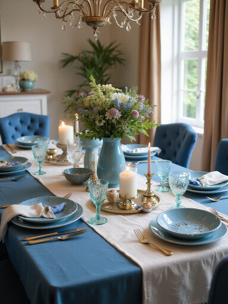
10. Style Your Table for Cohesive Beauty
Your dining table serves as the central stage for your blue dining room, and how you style it can reinforce your color scheme while adding personality and seasonal interest. A well-styled table creates a focal point that draws people into the space and encourages them to linger over meals. Consider both everyday styling and special occasion arrangements that work with your blue palette.
Build your tablescape in layers, starting with a foundation like a table runner or placemats, then adding height with candlesticks or small floral arrangements. The colors you introduce through dishes, linens, and decorative objects should complement your blue walls while adding visual interest. Natural elements like fresh flowers or seasonal fruit bring life to the space and create a connection to the outdoors.
- Foundation layers: Table runners, placemats, or charger plates set the base
- Height variation: Candlesticks, small vases, or decorative objects add dimension
- Natural elements: Fresh flowers or greenery bring life and seasonal change
Picture the warmth of evening conversations around a thoughtfully styled table that celebrates your blue palette…
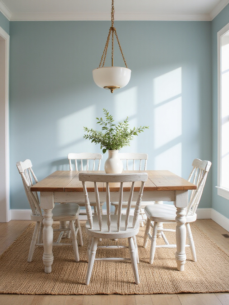
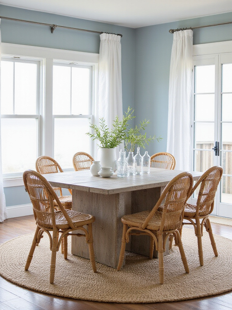
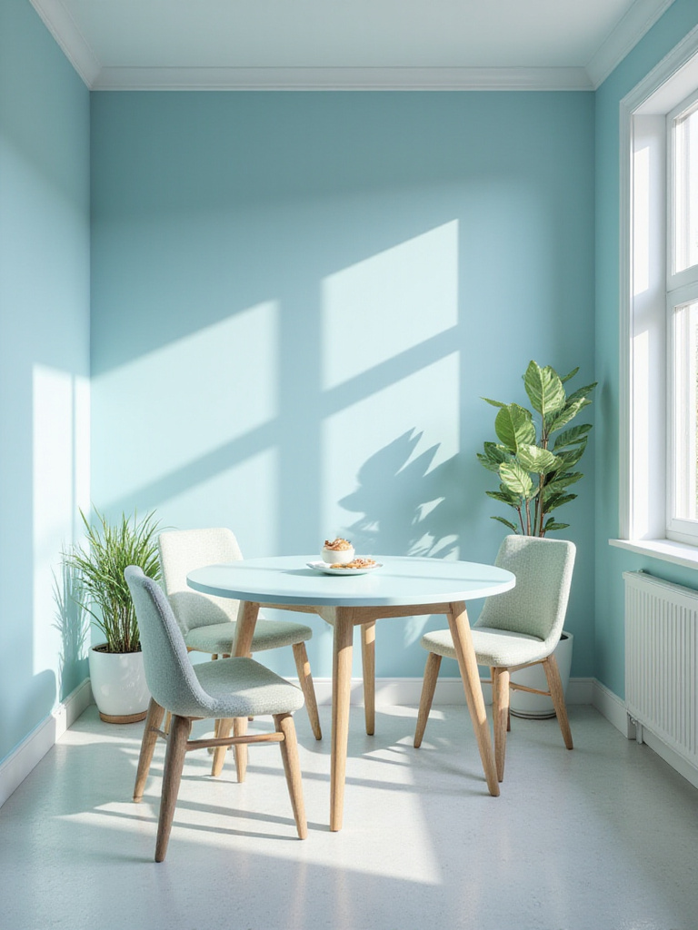
11. Embrace Light Blues for Spacious Serenity
Light blue shades possess an almost magical ability to make dining spaces feel larger and more open, perfect for smaller homes or apartments where every square foot counts. These gentle hues reflect natural light beautifully, creating an airy atmosphere that feels both calm and uplifting. Powder blue, sky blue, and pale aqua all work wonderfully in dining spaces, each bringing its own subtle personality to meal times.
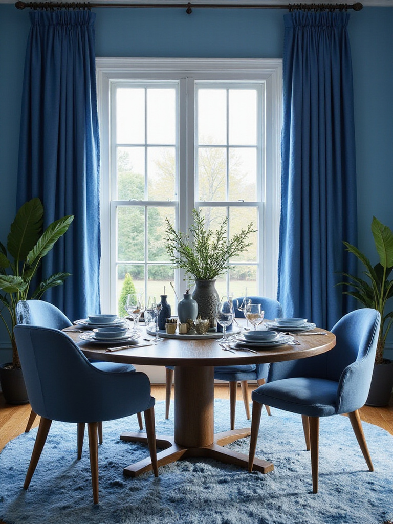
The psychology of light blues promotes relaxation and clear thinking, making them ideal for spaces where you want to encourage leisurely meals and meaningful conversations. These shades work particularly well in breakfast nooks or casual dining areas where you want to start each day with a sense of peace and possibility. Pair light blues with crisp white trim and natural materials to prevent the space from feeling too cool or sterile.
“Light blues have this incredible ability to make you feel like you’re dining under an open sky, even in the smallest city apartment.” – Color Consultant Maria Killam
As morning light filters through, the texture creates an ever-changing backdrop for your daily rituals…
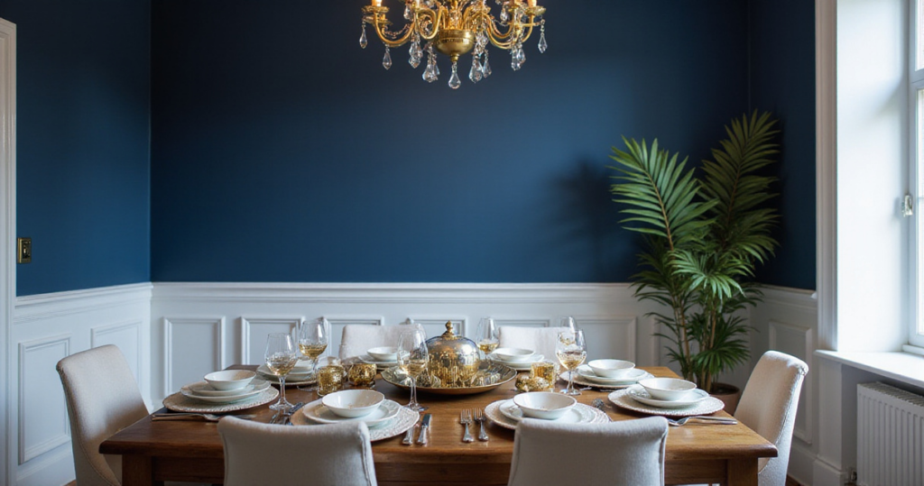
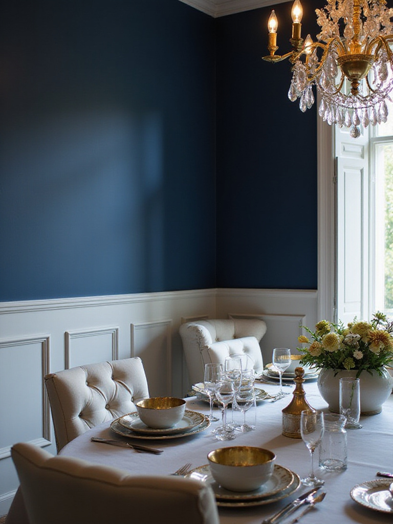
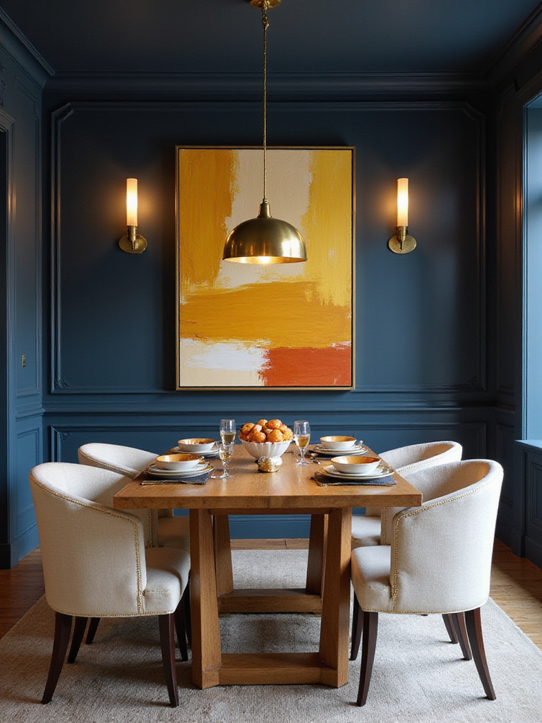
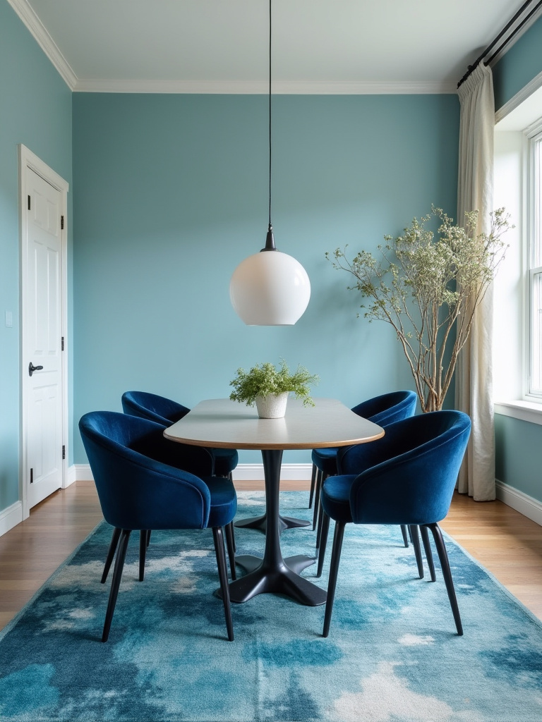
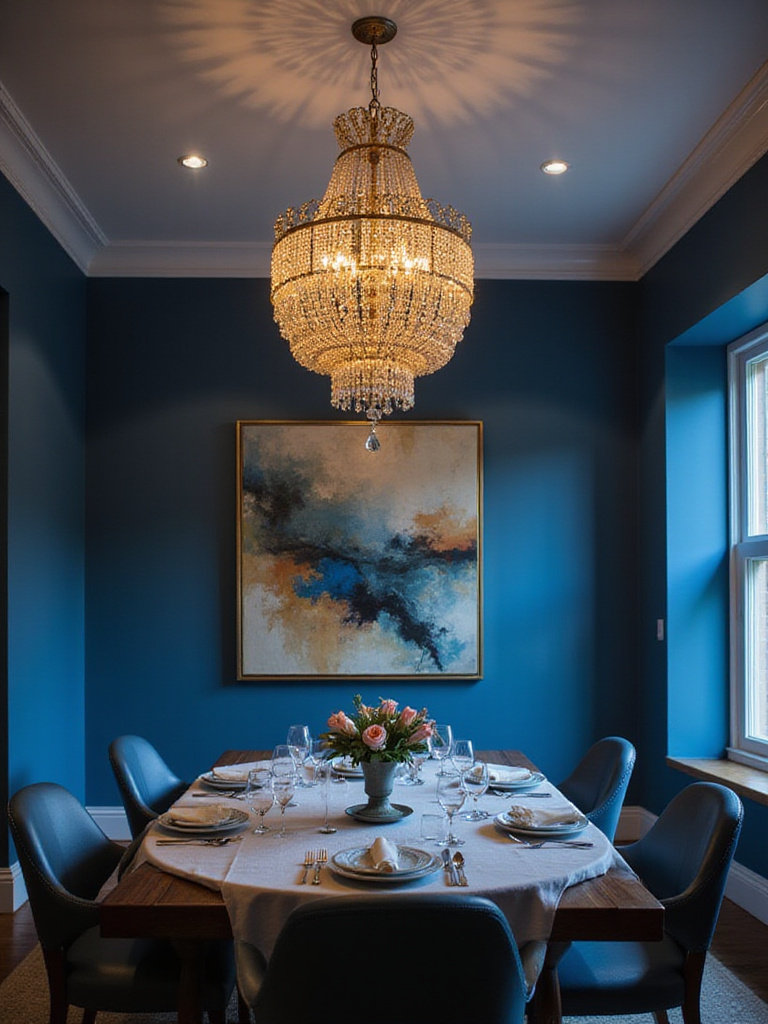
12. Create Drama with Deep Navy Sophistication
Navy blue brings instant sophistication and drama to dining spaces, creating an intimate atmosphere that makes every meal feel special. This rich, complex color works beautifully in both traditional and contemporary settings, serving as a neutral that’s far more interesting than beige or gray. Navy’s depth creates a cocooning effect that makes large dining rooms feel more intimate while adding gravitas to formal entertaining.
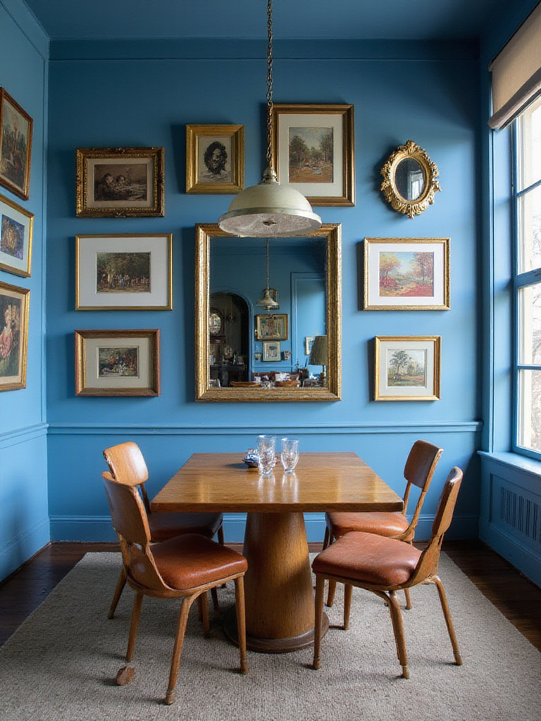
The key to successfully using navy in dining spaces is balancing its intensity with lighter elements and warm accents. Brass fixtures, warm wood tones, and cream-colored upholstery all work beautifully against navy walls, preventing the space from feeling too dark or overwhelming. Navy also provides a stunning backdrop for artwork and decorative objects, making colors appear more vibrant and metals more lustrous.
- Formal elegance: Navy creates sophisticated atmosphere for entertaining
- Versatile backdrop: Enhances artwork, metals, and decorative objects
- Intimate dining: Deep color creates cozy, conversation-friendly spaces
The environmental story behind this choice involves creating spaces that feel both timeless and deeply personal…
13. Maximize Small Spaces with Strategic Blue Choices
Small dining areas benefit enormously from strategic blue color choices that create the illusion of expanded space while maintaining visual interest. Lighter blues with cool undertones naturally recede, making walls appear farther away and rooms feel larger. This optical effect works especially well in urban apartments or breakfast nooks where space is at a premium but style shouldn’t be compromised.
Consider painting your ceiling the same light blue as your walls to eliminate visual boundaries and create a seamless, expansive feeling. This technique, often called “color drenching,” makes small spaces feel intentionally designed rather than cramped. Pair your space-expanding blue with mirrors, glass elements, and light-colored furniture to maximize the illusion of spaciousness.
- Cool-toned blues: Create visual recession and expand perceived space
- Monochromatic schemes: Eliminate visual breaks that can make spaces feel choppy
- Reflective elements: Mirrors and glass amplify light and space-expanding effects
Even in smaller spaces, here’s how this works to create dining areas that feel both intimate and airy…
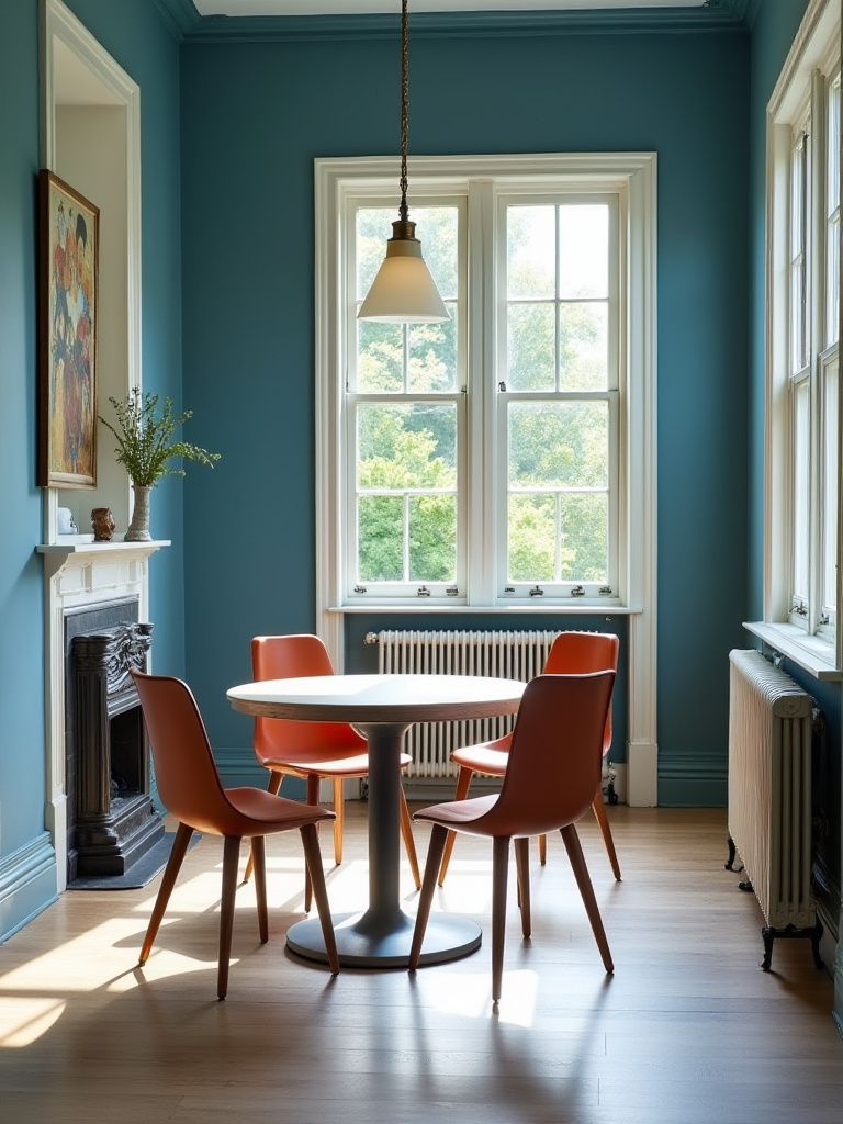
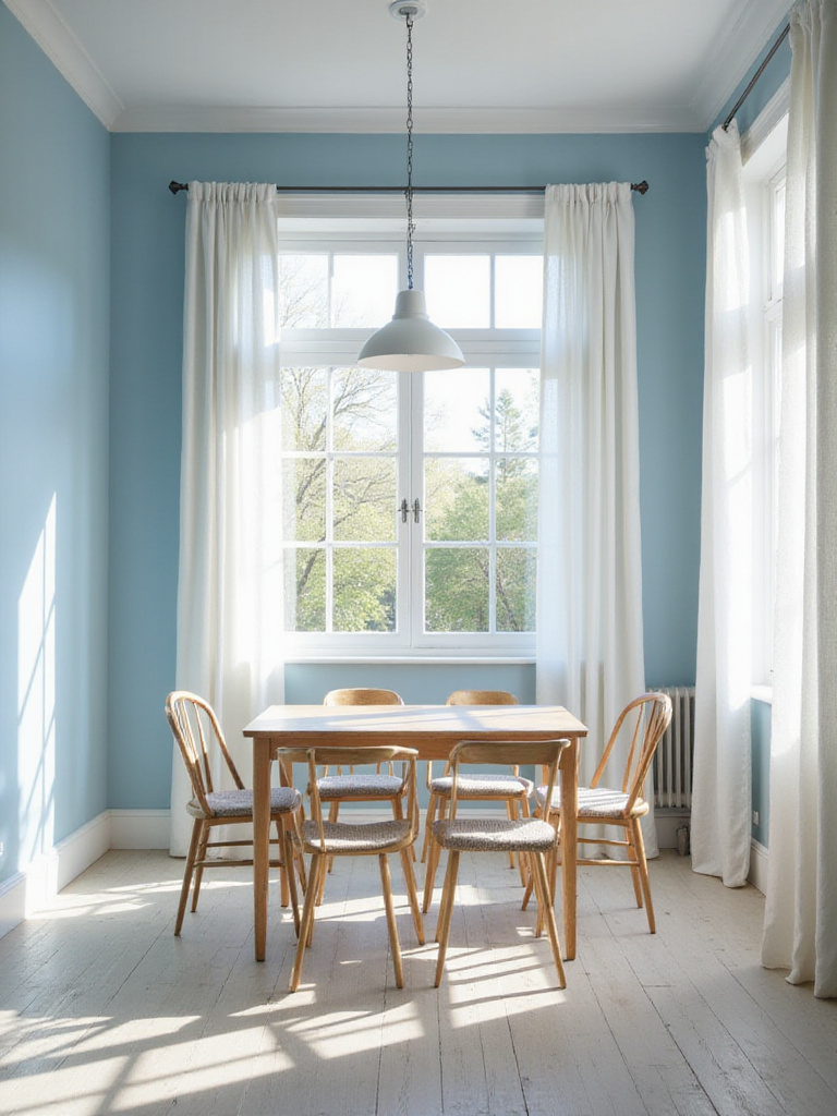
14. Balance Blue with Natural Light Optimization
Natural light transforms how blue appears in your dining space, revealing undertones and creating dynamic color changes throughout the day. Maximizing natural light prevents blue from feeling cold or dark while allowing you to appreciate the full complexity of your chosen shade. Consider your room’s orientation and existing windows when selecting your blue—north-facing rooms might need warmer blue tones, while south-facing spaces can handle cooler shades.
Window treatments play a crucial role in light optimization. Choose options that provide privacy when needed while allowing maximum light penetration during the day. Sheer curtains, roman shades, or adjustable blinds all work well in blue dining rooms. Consider adding mirrors strategically to bounce natural light around the room and amplify its effects on your blue walls.
- Window placement: Consider orientation when choosing blue undertones
- Light-filtering treatments: Maximize natural light while maintaining privacy
- Reflective surfaces: Use mirrors and metals to amplify available light
The ambient qualities change dramatically as natural light shifts from morning to evening…
15. Layer Textures for Visual and Tactile Interest
Texture becomes especially important in blue dining rooms because it prevents monochromatic spaces from feeling flat or boring. Layer different textures through your furniture choices, textiles, and decorative objects to create visual depth and tactile appeal. Smooth painted walls might be balanced with rough-hewn wood furniture, nubby linen upholstery, and glossy ceramic accessories.
Consider how different textures interact with light in your blue space. Matte finishes absorb light and create depth, while glossy surfaces reflect it and add sparkle. Textured wallpaper or fabric wall coverings can add dimension to accent walls, while varied textile weights in curtains, rugs, and table linens create layers of visual interest that reward closer inspection.
- Matte textures: Add depth and sophistication to blue walls
- Glossy elements: Reflect light and create visual interest
- Natural textures: Ground the space and add organic appeal
The tactile experience changes the entire room’s energy when you incorporate varied surface treatments…
16. Integrate Seasonal Elements for Year-Round Appeal
Your blue dining room can adapt beautifully to seasonal changes through strategic styling that keeps the space feeling fresh and current. Blue provides an excellent foundation for seasonal decorating because it works with both warm and cool accent colors. Spring might bring coral and yellow accents, while fall could introduce warm oranges and deep burgundies that complement your blue base.
Consider elements that can easily change with the seasons: table linens, centerpieces, artwork, and decorative accessories all offer opportunities for seasonal updates without major renovation. This approach keeps your dining space feeling dynamic and prevents color fatigue that can occur with completely static decorating schemes.
- Spring/Summer: Light, fresh accents in coral, yellow, or green
- Fall/Winter: Warm, rich accents in orange, burgundy, or gold
- Year-round elements: Blue foundation remains constant while accents change
The forecast for next season already hints at how adaptable your blue foundation will prove…
17. Create Focal Points with Statement Elements
Every successful blue dining room needs strategic focal points that draw the eye and create visual hierarchy. These might include a dramatic light fixture, an oversized piece of artwork, a beautiful built-in cabinet, or even an accent wall in a different shade of blue. The key is creating one primary focal point that anchors the space while supporting elements enhance rather than compete.
Consider the sightlines in your dining room when planning focal points. What do guests see first when entering the space? What elements are visible from adjacent rooms? Your focal points should work together to create a cohesive visual story that guides people through the space and encourages them to appreciate the thoughtful design details you’ve incorporated.
- Primary focal point: One dominant element that anchors the space
- Supporting elements: Enhance without competing with the main focus
- Sightline consideration: Plan for views from multiple angles and entry points
The designer’s attention to detail shows in how each focal point relates to your overall blue narrative…
18. Finish with Personal Touches That Tell Your Story
The final layer of your blue dining room should reflect your personal style and create emotional connections that make the space truly yours. This might include family photographs in frames that complement your blue palette, collections of ceramics or glassware that add color and interest, or heirloom pieces that bring history and meaning to your dining space.
Personal touches transform a well-designed room into a beloved gathering place where memories are made. Consider how your blue foundation supports and enhances these meaningful elements rather than overwhelming them. The goal is creating a space that feels both beautifully designed and authentically personal, where guests immediately sense the care and thought you’ve invested in creating something special.
- Family photographs: Choose frames that complement your blue palette
- Collections: Display meaningful objects that add personality
- Heirloom pieces: Incorporate items with personal history and significance
Your blue dining room journey culminates in these personal elements that make the space uniquely yours, creating a foundation for countless future memories around your thoughtfully designed table.
Conclusion
These 18 ideas demonstrate the remarkable versatility and enduring appeal of blue in dining spaces. From the space-expanding magic of powder blue to the dramatic sophistication of navy, blue offers solutions for every style preference and spatial challenge. The key lies in understanding how different shades interact with light, how complementary elements can enhance or balance cool tones, and how personal touches transform designed spaces into beloved gathering places.
Your blue dining room represents more than a color choice—it’s an investment in creating daily moments of beauty and connection. Whether you’re sharing quick weekday breakfasts or hosting elaborate dinner parties, the thoughtful design decisions you make today will enhance countless future memories. The calming properties of blue, combined with strategic design choices, create spaces that naturally encourage people to slow down, savor their meals, and enjoy meaningful conversations.
Start with the ideas that resonate most strongly with your vision and lifestyle. Perhaps you’ll begin with a single accent wall in a bold navy, or maybe you’re ready to embrace the full drama of a color-drenched powder blue space. Remember that the best blue dining room is one that reflects your personal style while creating an atmosphere where family and friends love to gather, share meals, and create the memories that make a house truly feel like home.