Can we just talk for a minute about why everyone gets blue bedrooms wrong? People think “blue” and they think “calm,” so they slap some sky blue on the walls, get a matching duvet, and wonder why the room feels like a cold, sterile doctor’s office. It drives me nuts. Blue isn’t just one thing. It can be cozy and enveloping like a midnight sky, or it can be brisk and chilly like a winter morning. The difference isn’t the color; it’s the texture, the light, and the layers.
I used to think it was simple, too. Then I spent a week trying to fix a client’s “calm” blue bedroom that felt more like a walk-in freezer. They’d picked a beautiful periwinkle from a tiny paint chip under the harsh lights of a hardware store. But in their north-facing bedroom, that periwinkle turned into a sad, moody gray with a weird purple tinge. That’s when it really clicked for me: what actually matters isn’t the blue you pick, but how you make it live in your space. Forget the corporate speak and the perfect-looking magazine photos. Here’s the real story on how to create a blue bedroom you actually want to sink into.
Designing Your Blue Haven: Foundational Planning (Part 1)
Before you even think about touching a paintbrush, we need to lay the groundwork. This is the part everyone skips because it’s not as fun as picking out pillows, but it’s the difference between a room that works and a room you’ll be repainting in a year. Trust me on this.
1. Assess Your Room’s Natural Lighting for Blue Shade Selection
The single biggest mistake people make is ignoring their windows. The light that comes into your room is the most important ingredient in your color recipe, and it changes all day long. A blue that looks soft and dreamy in a bright, south-facing room can turn steely and depressing in a north-facing room that gets cool, indirect light. You absolutely have to know what kind of light you’re working with before you commit to a color.
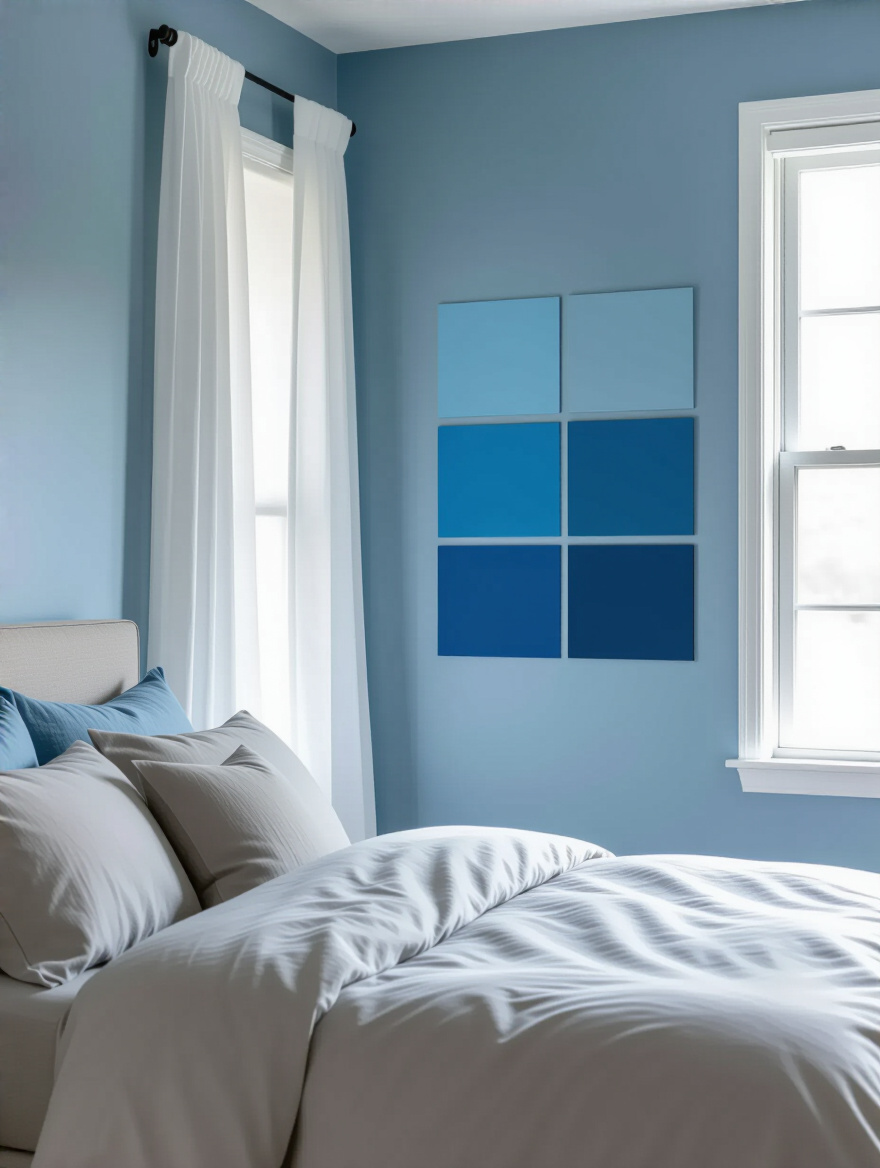
My advice? Spend a weekend being a light detective. Grab a big white poster board and move it around the room at different times—morning, noon, late afternoon. Watch how the light changes, where it’s warm, where it’s cool, and where the shadows fall. That little two-inch paint chip from the store is a liar; you need to see how a large swatch of color breathes in your own light before you can trust it.
Understanding your light sets the stage for every other choice you’ll make.
2. Define Your Desired Blue Mood: Calm, Energizing, or Luxurious Ambience
What do you want to feel when you walk into your bedroom? This isn’t a trick question. Do you want to feel instantly wrapped in a cozy, sleepy hug? That’s one kind of blue. Do you want to feel a little bit of crisp energy to help you wake up in the morning? That’s another. Or do you want to feel like you’ve checked into a five-star hotel, surrounded by deep, moody luxury? That’s a whole different vibe.
Get on Pinterest or tear pages out of magazines and stop thinking about specific shades. Instead, pay attention to the words you use to describe the pictures you save. Are you pinning rooms you’d call “serene,” “dramatic,” or “airy”? Once you have your feeling-word, then you can start looking for the blues that evoke it. A calm blue often has a touch of gray or green in it, while a luxurious one is deep and jewel-toned, like a sapphire.
This emotional compass will keep you from getting distracted by a color that’s pretty, but not right for the sanctuary you’re trying to create.
3. Create a Harmonious Blue Color Palette with Complementary Hues
Okay, you’ve decided on a blue mood. Now, please, I’m begging you—don’t just use one shade of blue everywhere. A room needs depth and contrast to feel alive, otherwise it’s just a flat, boring box. The secret is to build a palette around your main blue. Think of it like an outfit: your main blue is the dress, but you still need the shoes, the bag, and the jewelry to make it interesting.
The easiest way to do this is to look at a color wheel. The colors opposite blue—oranges, corals, warm yellows—are its complements. You don’t need a loud, construction-cone orange. Think of a muted terracotta, a soft peach, or the warm glow of brass or gold. Just a few touches of a warm complementary color will make your blues feel richer and more intentional. You also need neutrals, like a creamy white or a soft gray, to give your eyes a place to rest.
Once you nail this palette, choosing pillows, throws, and art becomes so much easier because you have a clear roadmap.
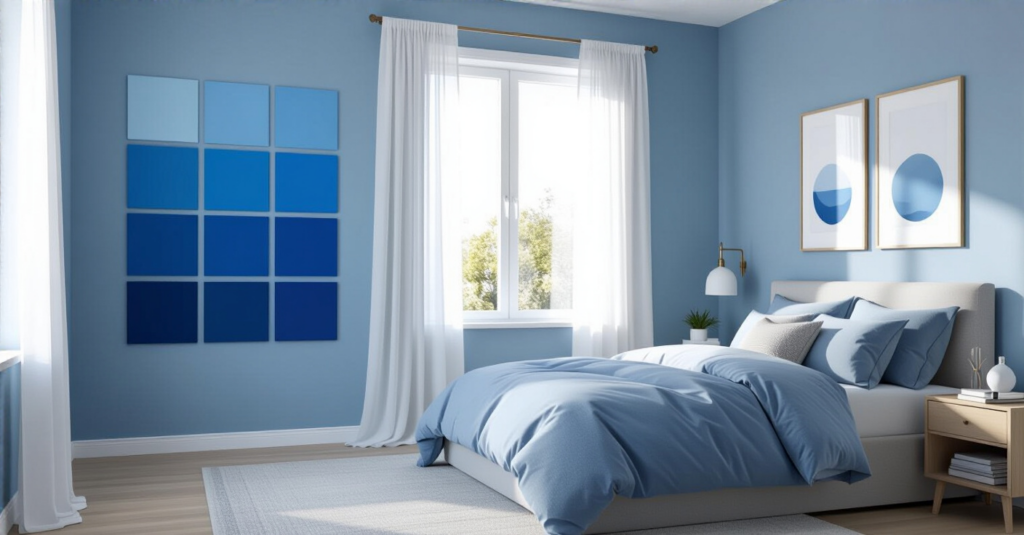
4. Understand the Impact of Undertones in Blue Paint Choices for True Color
This is the advanced, behind-the-scenes secret that designers know. Every color has a hidden color inside it—an undertone. A blue can have a green undertone (making it a teal), a purple undertone (making it a periwinkle or indigo), or a gray undertone (making it a slate or denim). If you don’t see the undertone, it can come back to bite you. It’s why your “perfect gray-blue” paint suddenly looks purple next to your beige carpet.
Here’s the shortcut: When you’re looking at blue paint chips, hold them up against a true primary blue, a true green, and a true purple. The undertone will immediately jump out. A blue with a green undertone will feel more organic and earthy, while a blue with a purple undertone can feel more regal or sometimes even a bit chilly. Knowing this helps you coordinate your blue with the other fixed elements in your room, like your flooring or furniture.
Paying attention to undertones will save you from that horrible “Why does this color look so weird in here?” moment.
Designing Your Blue Haven: Foundational Planning (Part 2)
So, you’ve done your homework on light, mood, and color theory. Now we can start making some of the bigger decisions about how and where all this gorgeous blue is going to live in your room. This is where the vision starts becoming a reality.
5. Plan Blue Application: Walls, Accents, or Both for Balanced Impact
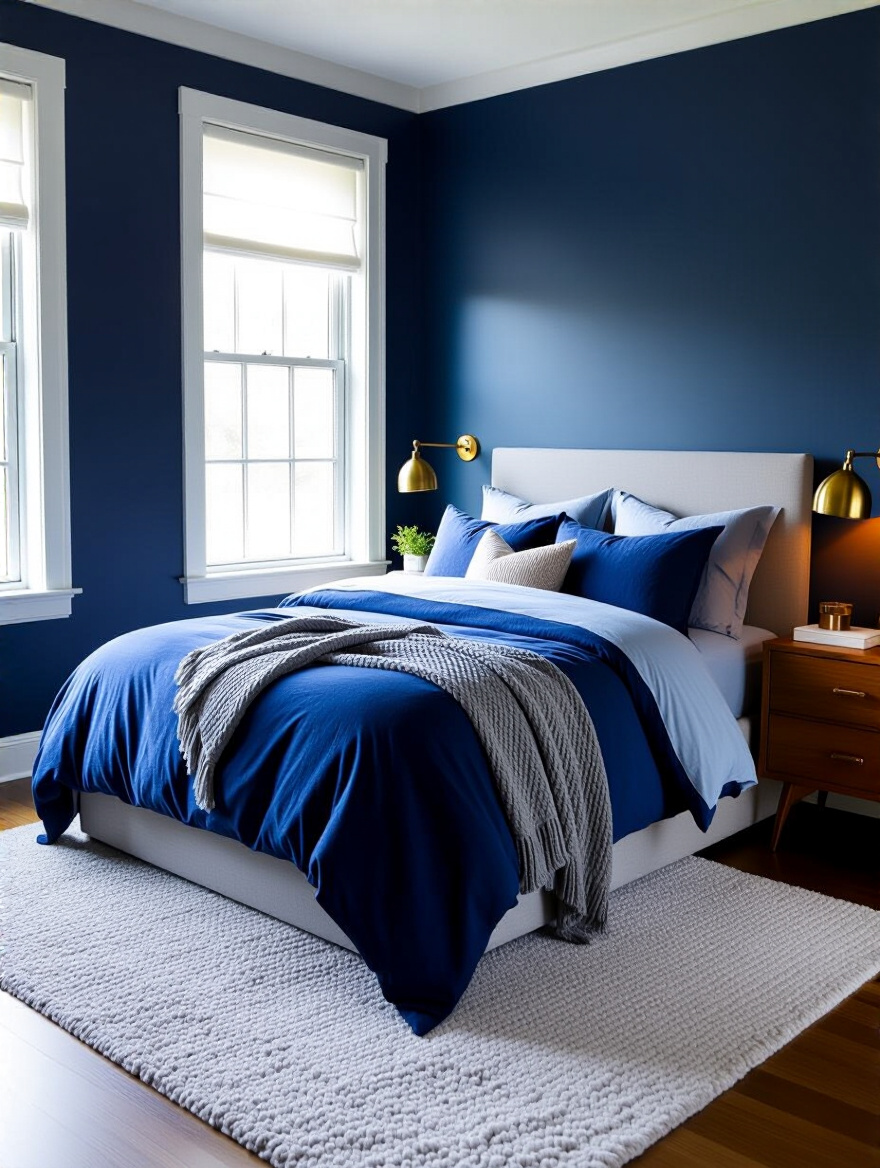
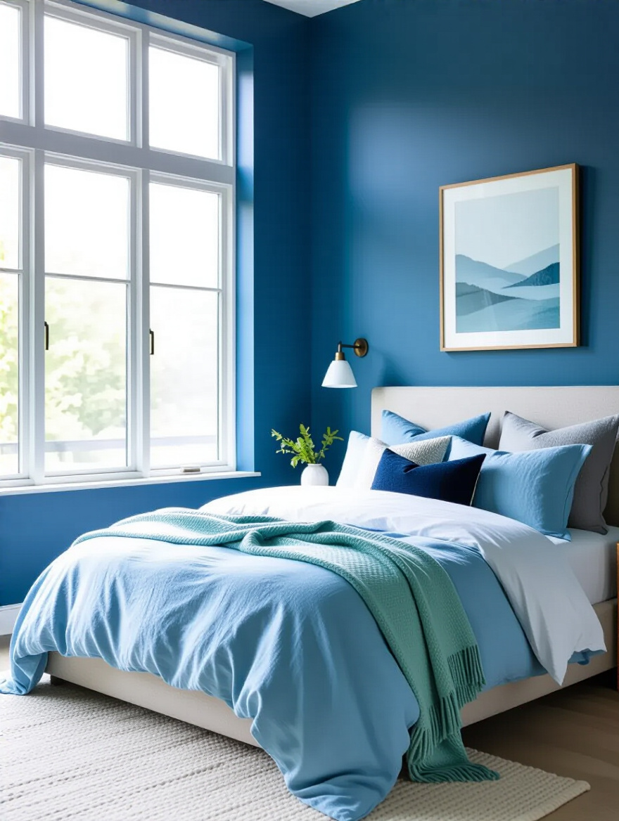
You don’t have to paint your entire room blue to have a blue bedroom. Deciding where the blue goes is just as important as the shade itself. You could paint all four walls for a completely immersive, cocoon-like feeling. This works best with softer, muted blues or in a large room with lots of light that can handle a dark, moody navy.
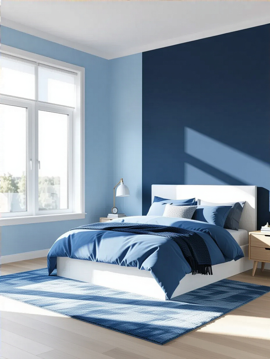
But maybe you want a lighter touch. An accent wall behind the bed can give you a powerful dose of color without overwhelming the space. Or you can keep the walls neutral and bring in blue through your largest pieces of furniture, your bedding, your rug, and your curtains. This approach gives you more flexibility to change things up later without having to repaint. There’s no right answer—it all goes back to the mood you want to create.
Thinking about application helps you control the dose of blue, making sure it’s just right for your space.
Bringing Blue to Life: Core Design Elements (Part 1)
This is the fun part. We’re getting into the tangible things, the textiles and furniture that you’ll see and touch every day. These are the core pieces that will carry your blue theme and create that layered, cozy feeling we’re aiming for.
6. Choose the Right Blue Wall Paint Finish for Optimal Reflection and Durability
If you do decide to paint, the finish is just as important as the color. Think of it as the texture of your wall. A matte or flat finish has a soft, velvety look that absorbs light. It feels incredibly calming and sophisticated and it’s excellent at hiding little bumps or imperfections in the wall. This is my go-to for creating a truly cozy, enveloping bedroom sanctuary.
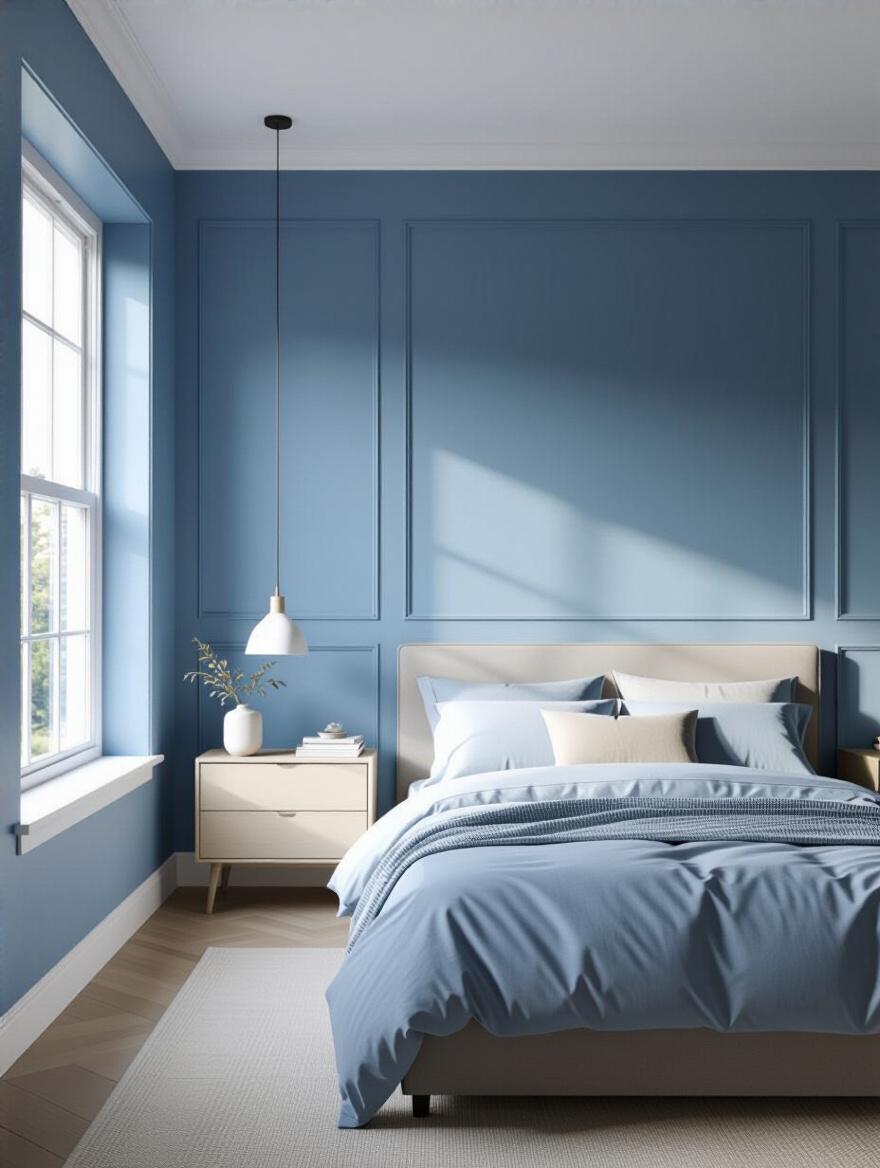
An eggshell or satin finish has a very slight sheen. It will bounce a little light around, which can be nice in a darker room, and it’s easier to wipe clean. I often recommend using a washable matte or eggshell on the walls and then using a satin finish on the trim, doors, and window frames. This technique, called sheen-layering, adds a subtle layer of dimension and architectural detail without adding another color. It just makes everything feel more polished and considered.
The finish you choose can completely change the way your blue color feels in the room, so don’t just grab whatever’s on sale.
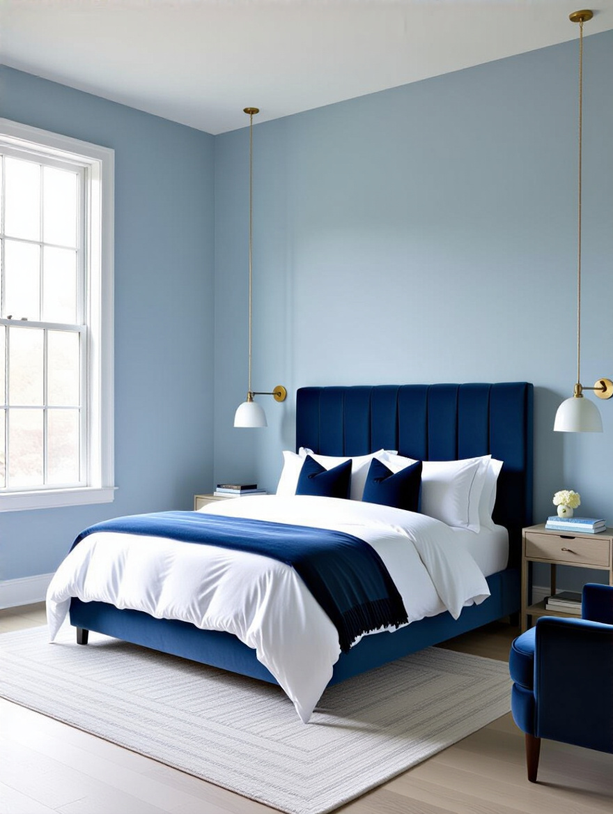
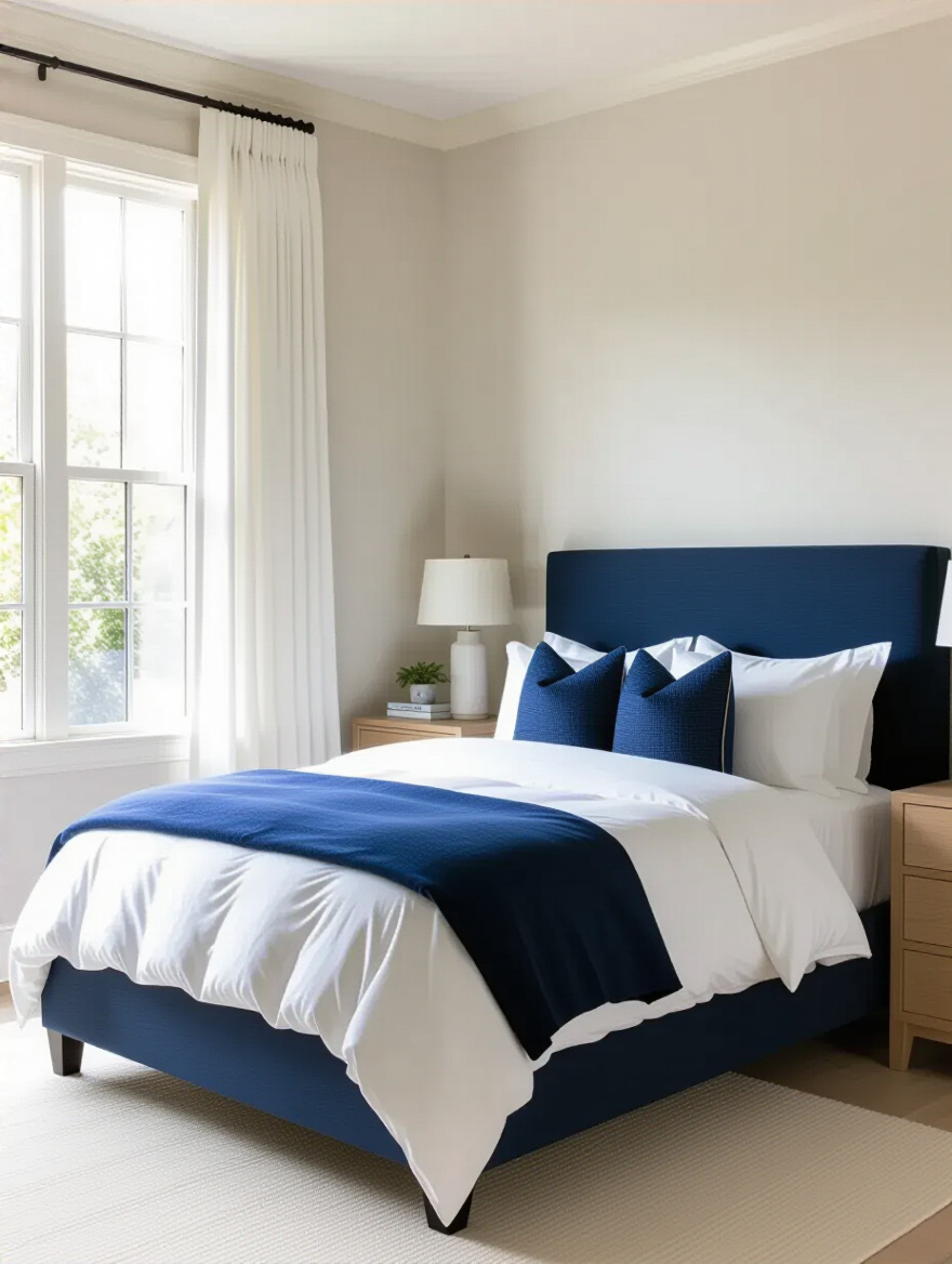
7. Select Major Blue Furniture Pieces to Anchor the Room’s Scheme
If the idea of painting your walls blue feels like too much of a commitment, let your furniture do the talking instead. A Statement Piece like a deep blue velvet upholstered headboard, a navy-painted dresser, or a comfy armchair in a dusty blue linen can anchor the entire room’s color scheme. It gives you a strong focal point and makes the rest of your decorating decisions so much simpler.
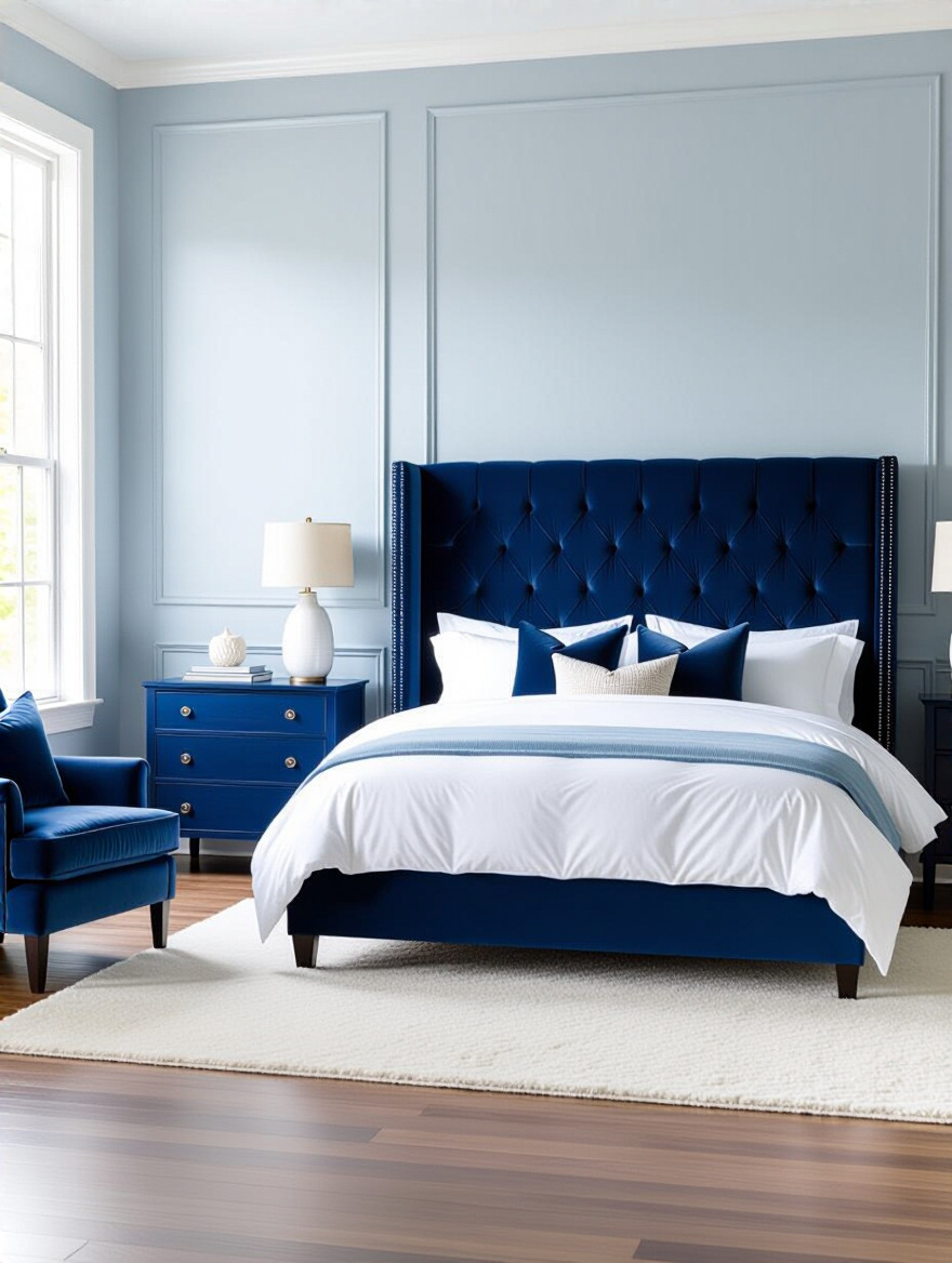
When you have a big, beautiful blue piece, you can keep your walls a soft neutral, like a creamy white or a warm gray. Then, you just need to sprinkle smaller touches of blue throughout the room—in your pillows, your art, a vase—to tie it all together. This approach feels very high-end and intentional. And if you get tired of it in a few years, it’s a lot easier to reupholster a chair than to repaint a whole room.
A bold piece of furniture makes a confident statement and grounds your entire blue design.
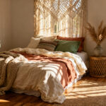
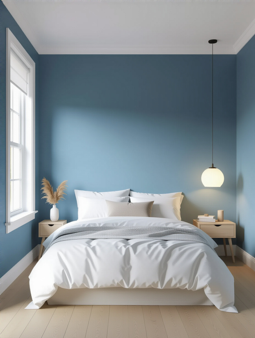
8. Incorporate Blue Bedding and Linens for Cohesive Comfort and Layering
This is my favorite part because, as a textile expert, I know the bed is the true heart of the bedroom. This is where you can really play with shades and textures to create ultimate coziness. Please, don’t just buy a “bed-in-a-bag.” They always look flat and lifeless. The secret to a beautiful, inviting bed is layering.
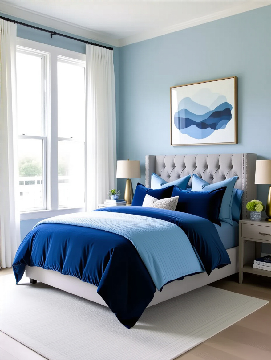
Start with a foundational color for your duvet or comforter, maybe a solid mid-tone chambray or a deep navy linen. Then layer in sheets in a lighter shade, or even a crisp white for contrast. The magic happens with the pillows and throws. Mix different shades of blue, from sky to indigo. And mix your textures: a smooth cotton sateen pillowcase, a nubby knit throw blanket, and a couple of plush velvet accent pillows. You want a bed that looks and feels like you could just dive into it.
“A well-layered bed isn’t just about color; it’s a tactile invitation to relax. The mix of cool, smooth cotton against soft, warm wool is what true comfort feels like.” – Willow
Playing with bedding is the most effective and least permanent way to bring your blue theme to life.
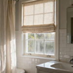
9. Layer Blue Window Treatments for Light Control and Aesthetic Appeal
Windows often feel like an afterthought, but they’re a huge opportunity to add another layer of soft texture and color. Layering your window treatments gives you incredible flexibility for controlling light and privacy while looking incredibly chic. It’s a classic designer trick that makes any room feel more finished.
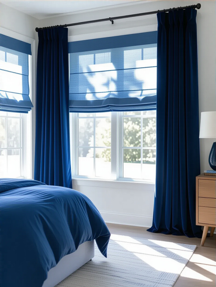
The best way to do this is with a double curtain rod. On the rod closest to the window, hang a set of simple, light-filtering sheer curtains. They could be white or a very pale blue. This gives you privacy during the day while still letting soft, diffused light into the room. On the outer rod, hang your main curtains. These can be a heavier fabric, like linen or velvet, in a richer shade of blue. They’ll block light for sleeping and add a beautiful frame of color to your window.
This double-layer approach gives you function and beauty, turning a plain window into a true design feature.
Bringing Blue to Life: Core Design Elements (Part 2)
We’ve covered the big surfaces and the soft spots. Now let’s talk about the elements that ground the room and set the mood—the things underfoot and overhead that pull the whole design together.
10. Utilize Blue Area Rugs to Define Zones and Add Underfoot Texture
A rug is what grounds a room. It pulls all the furniture together and defines a space, especially the sleeping area. In a bedroom, the feeling of stepping out of bed onto something soft and plush is just pure luxury. A blue rug is a fantastic way to anchor your color scheme from the floor up.
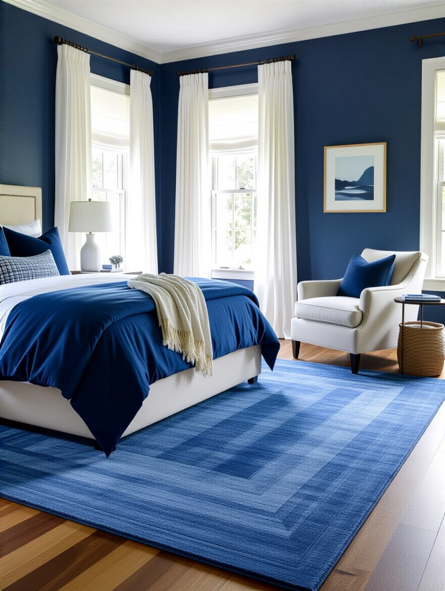
Make sure you get the right size! This is the most common rug mistake. For a bedroom, the rug should be large enough to extend at least 18-24 inches around the sides and foot of your bed. You want to see a generous border of that beautiful blue texture. Don’t be afraid of pattern, either. A vintage-style rug with faded blues and touches of a warm complementary color can add incredible character to a room.
The texture underfoot is a powerful sensory signal for comfort, so choose something that feels wonderful on bare feet.
11. Introduce Blue Lighting Fixtures for Atmospheric Illumination and Style
Lighting isn’t just functional; it creates atmosphere. While I don’t recommend bathing your entire room in blue light, a subtle touch can be magical. Think about a lamp with a beautiful blue ceramic base, or even pendant lights with a dark blue metal shade flanking the bed. This is a way to incorporate your color in a sculptural, unexpected way.
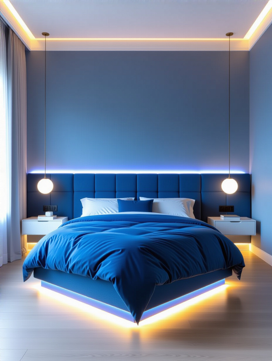
For a really advanced and moody effect, you can use smart LED strip lighting tucked behind a headboard or under a floating bed frame. You can set it to a very soft, deep blue glow in the evening to create an incredibly serene, almost ethereal atmosphere for winding down. The key is subtlety. You want a gentle wash of atmospheric light, not a rave.
Using lighting fixtures to carry your color theme adds a layer of sophistication that shows real design savvy.
12. Add Blue Storage Solutions for Practicality and Visual Flow
Storage can be beautiful! Instead of trying to hide your storage pieces, integrate them into your design. A dresser painted a gorgeous deep navy, a bookshelf with its back painted a soft sky blue, or a set of woven storage baskets in shades of indigo can all add to your room’s aesthetic while keeping clutter at bay.
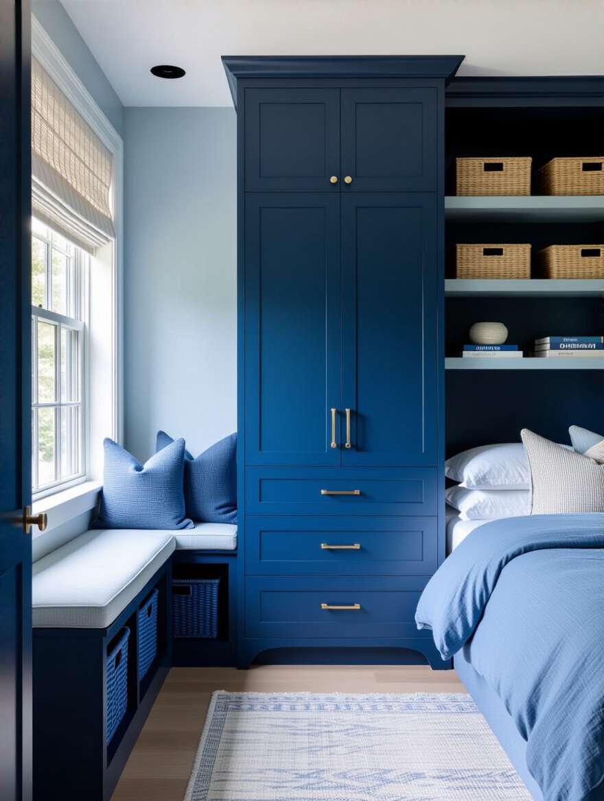
The goal is to make these functional pieces feel intentional and cohesive. By repeating your blue palette in your storage, you create a visual rhythm that guides the eye around the room and reinforces your theme. It helps a room feel organized not just physically, but visually, which is incredibly calming for the mind. An uncluttered space is a restful space.
Transforming utilitarian items into decorative features is a hallmark of a thoughtfully designed room.
Elevating Your Blue Bedroom: Decorative Touches & Balance (Part 1)
Now for the final layers—the details that infuse your personality and add that sparkle of warmth and life. These are the touches that take a room from “nicely decorated” to a truly personal sanctuary.
13. Mix Blue with Warm Metallics to Add Sophistication and Sparkle
A room that is only cool tones can feel a little one-dimensional. The secret weapon to make blue feel luxurious and warm is to add a touch of warm metal. Think brushed brass, soft gold, or even copper. These metallics act like jewelry for your room. The warm glow provides a beautiful contrast to the coolness of the blue, creating a perfect balance.
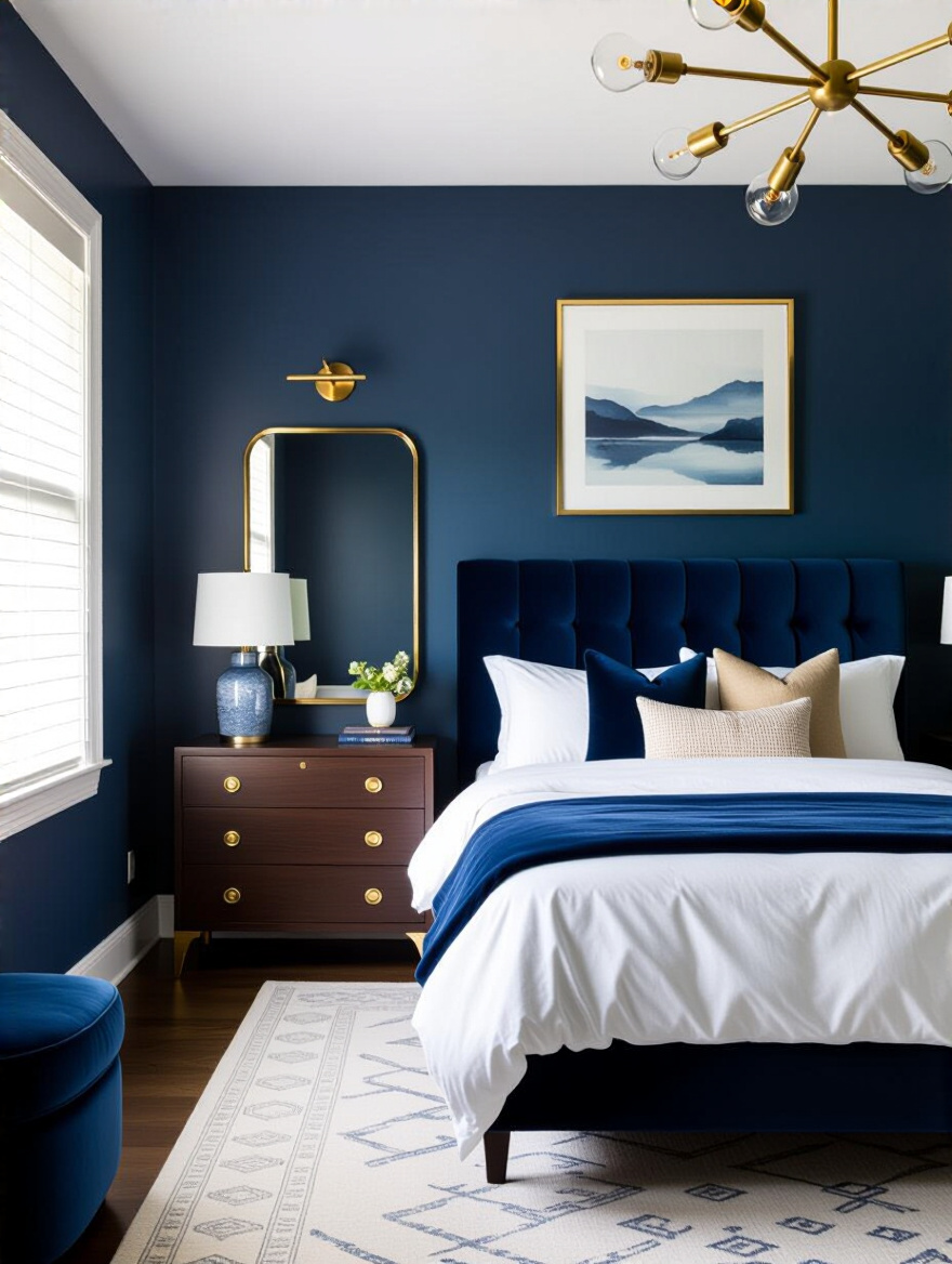
You don’t need to go overboard. Start small. Swap out the hardware on your dresser and nightstands for brass knobs. Add a floor lamp with a golden finish next to your reading chair, or hang a mirror with a simple gold frame. Just these few touches are enough to bounce light around the room and add a layer of warmth and sophistication that instantly elevates the entire space.
This simple pairing of cool blue and warm metal is a timeless combination that always looks chic.
14. Introduce Contrasting Art and Decor to Break Up Blue Monotony
Your walls are a canvas. Even if you love your blue paint color, a large, uninterrupted expanse of it can feel a bit blank. Art is the perfect way to break it up and inject your own personality into the space. Don’t feel like the art has to be blue! In fact, it’s often more interesting if it isn’t.
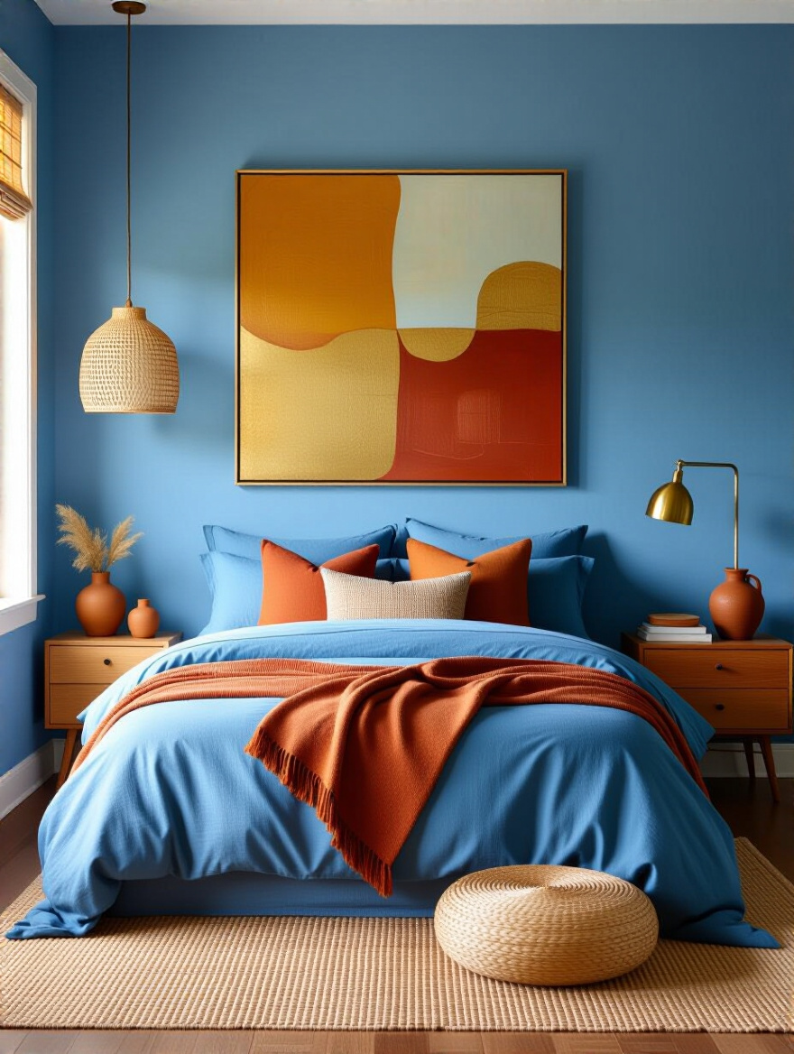
Look for a piece of art that has just a tiny hint of your room’s blue in it, but is dominated by other colors—especially those warm complementary tones we talked about, like peach, rust, or ochre. This will create a powerful focal point and tie your whole color palette together. The same goes for decorative objects like vases or bowls. A terracotta pot or a warm wooden sculpture on your dresser can provide a much-needed moment of contrast.
Art and decor are what give a room its soul, so choose pieces that you truly love.
15. Integrate Natural Textures like Wood or Rattan with Blue Accents
Along with warm metals, natural textures are essential for warming up a blue room. Wood, rattan, wicker, and jute add an organic, earthy quality that makes blue feel less formal and more grounded. The contrast between the cool, smooth blue and the warm, nubby texture of a natural fiber is just delicious.
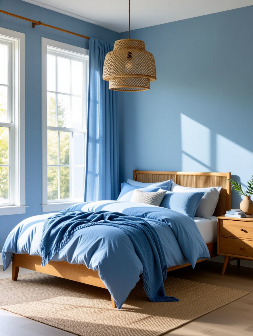
This can be as simple as a light-colored oak bed frame, a woven rattan pendant light, or a couple of wicker baskets for storing extra blankets. These elements bring a sense of the outdoors in and keep the room from feeling too sterile or precious. They remind me of a coastal home, where the deep blues of the ocean are always balanced by the warm tones of sand and driftwood.
This blend of natural elements with a cool color palette creates a space that feels both serene and deeply comforting.
16. Leverage Blue Botanical Elements and Indoor Plants for a Refreshing Touch
Nothing breathes life into a room quite like a living plant. The vibrant green of the foliage is a natural and beautiful counterpoint to any shade of blue. It adds an organic shape and a pop of life that keeps the room feeling fresh and vital. Plus, many houseplants are great for purifying the air, which is a wonderful bonus for a sleep sanctuary.
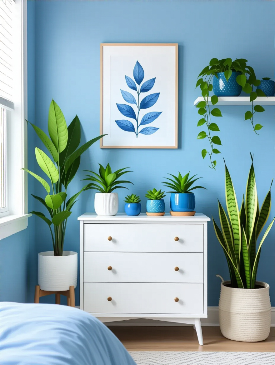
You can also tie your botanical elements into your blue theme. Choose planters and pots in shades of blue, from glossy navy ceramic to hand-painted terracotta. You could also hang Botanical Art prints with blue backgrounds or find throw pillows with a blue-and-green leaf pattern. This creates a cohesive look that feels connected to nature.
Adding greenery is the easiest and most affordable way to make your blue sanctuary feel alive and refreshing.
Elevating Your Blue Bedroom: Decorative Touches & Balance (Part 2)
We’re in the home stretch, focusing on creating those special corners and personal touches that make a room truly yours. These final steps are all about curating a space that supports you and reflects who you are.
17. Create a Serene Blue Reading Nook with Cozy Seating and Task Lighting
Even in a bedroom, it’s wonderful to have a little zone that isn’t about sleeping. Carve out a corner and create a dedicated reading nook. All you need is a comfortable chair, a small table, and good light. This gives you a place to unwind with a book or a cup of tea, signaling to your brain that it’s time to relax before you even get into bed.
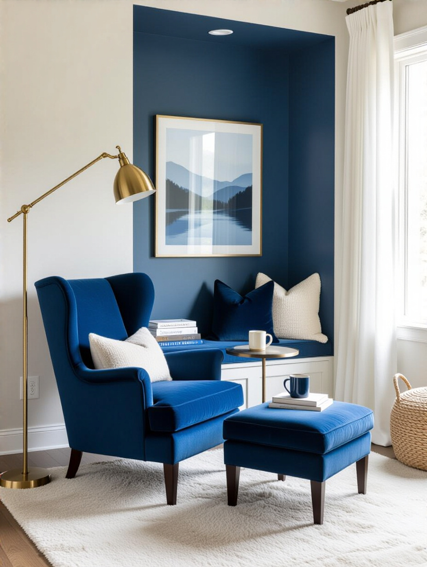
Make this spot extra cozy by choosing an armchair upholstered in a beautiful blue fabric, or a neutral chair piled with blue pillows and a super-soft throw. The most important element is the lighting. Don’t rely on your overhead light. You need a dedicated task light, like a floor lamp that arches over your shoulder, to prevent eye strain and create a warm, focused pool of light.
This little “room within a room” will quickly become your favorite spot to decompress from the day.
Personalization and Long-Term Charm: Advanced Styling & Care
Your room is almost complete. These final tips are about making sure your design has staying power—that it reflects you perfectly and continues to feel fresh and inviting for years to come.
18. Explore Blue-Themed Wallpaper or a Feature Wall for Dynamic Visual Interest
If a solid blue accent wall feels a bit too plain for you, wallpaper is an amazing way to add pattern, texture, and a huge dose of personality. A blue-themed wallpaper behind the bed can act like a piece of large-scale art, creating an instant focal point and setting a specific tone for the room, whether it’s a romantic floral, a modern geometric, or a subtle grasscloth texture.
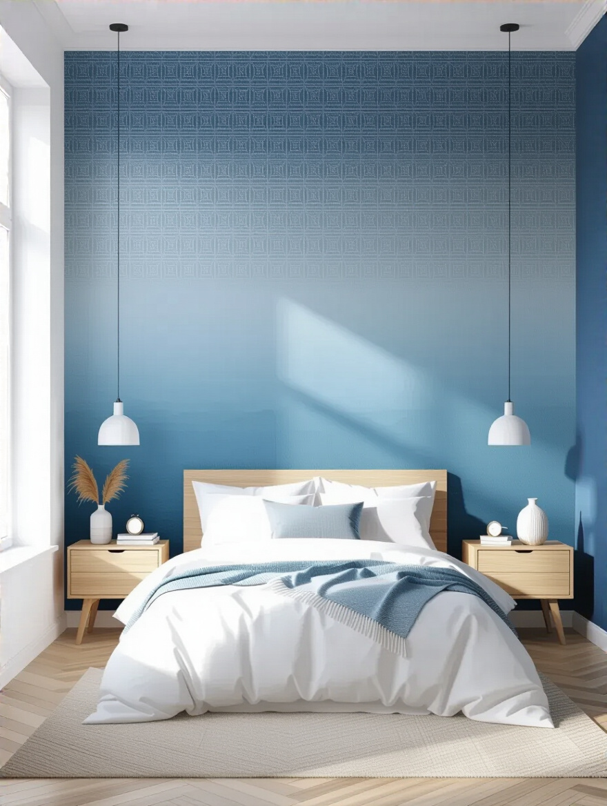
Today’s peel-and-stick wallpapers are fantastic for renters or for those who are a little nervous about commitment. They are easy to install and easy to remove, giving you the freedom to be bold without the long-term stress. Choose a pattern that incorporates your main blue along with some of your accent and neutral colors for a beautifully cohesive look.
A feature wall with pattern is a powerful design tool for adding depth and character to your blue sanctuary.
19. Design a Blue Gallery Wall Showcasing Personal Touches and Memories
A gallery wall is my favorite way to make a space feel deeply personal. It’s a collection of things you love—photos, art, postcards, mementos—that tells your story. To keep it from looking chaotic, use your blue color scheme as the unifying thread.
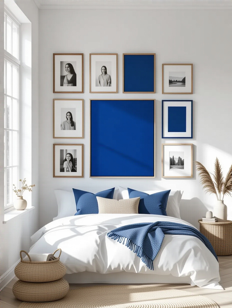
You could use frames in varying shades of blue, from navy to periwinkle, with different finishes. Or, keep the frames consistent (all black or all natural wood) and make sure the art and photos within them have strong blue elements. Don’t be afraid to mix things up! A balanced gallery wall has a mix of sizes, orientations (vertical and horizontal), and even includes non-framed items like a small woven plate or a decorative mirror.
This curated collection turns a blank wall into a visual diary and ensures your bedroom feels uniquely yours.
20. Avoid Overpowering Your Space: Balance Blue with Neutrals and White
This is the final and most important rule of decorating with any strong color: you need to give it space to breathe. If every single thing in your room is blue, your eyes will have nowhere to rest and the color will lose its impact. Balance is key. That’s where neutrals and white come in.
A good guideline is the 60-30-10 rule. Let 60% of your room be a dominant neutral (like warm gray walls and a beige rug). Let 30% be your secondary color (all of your beautiful blue elements—bedding, curtains, an accent chair). Then, let 10% be your accent (the crisp white of your trim, a few white pillows, and those warm metallic pops). This formula ensures your room feels balanced, serene, and sophisticated, not oversaturated.
White and neutrals are not the absence of design; they are the quiet background that makes your beautiful blue color the star of the show.
21. Keep Your Blue Bedroom Fresh: Seasonal Updates with Subtle Color Shifts
Once your beautiful blue bedroom is complete, the fun doesn’t have to stop. To keep the space feeling fresh and prevent you from getting bored, make small seasonal updates. This is so easy to do with your accent colors and textiles, and it keeps your room feeling alive and responsive to the world outside.
In the spring and summer, swap out your heavier throws for lightweight linen ones. Bring in pillows with touches of sunny yellow or soft coral. For autumn and winter, switch to warmer, cozier accents. Replace the coral pillows with ones in a rich terracotta or a deep mustard yellow. Change out your chunky knit blanket for one in a warm-toned plaid. These small, affordable swaps can completely change the mood of the room without any major effort.
A well-designed room should be able to evolve with you and the seasons, always feeling like a fresh and welcoming retreat.
Conclusion
So there you have it. Creating a blue bedroom that feels like a true sanctuary is so much more than just picking a paint color. It’s a dance between light and shadow, cool tones and warm accents, smooth textures and nubby ones. It’s about building layers of comfort that speak to all of your senses. By being intentional with these choices, you can craft a space that not only looks beautiful but genuinely helps you relax, recharge, and feel at home.
Don’t feel like you have to do all 21 things at once. Start with the one that excites you most. Maybe it’s finding the perfect, buttery-soft navy linen duvet, or creating a gallery wall of your favorite memories. Your journey to a truly cozy blue bedroom starts with that one small step. Go create a space that feels like a deep, calming exhale at the end of a long day. You deserve it.