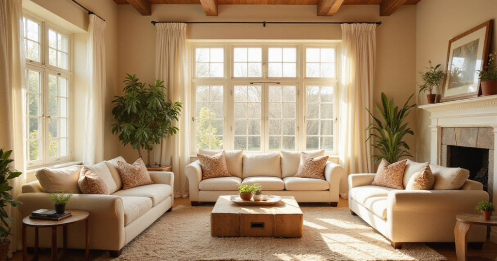
Choosing the perfect living room paint colors can transform your home’s heart from ordinary to extraordinary. This central gathering space deserves more than a hasty color decision – it needs hues that reflect your personality, enhance your daily comfort, and create the perfect backdrop for life’s moments. Yet with endless options and conflicting advice, many homeowners find themselves paralyzed by choice or, worse, living with regrettable paint decisions.
The stakes are higher than you might think. Color Psychology research shows that our surroundings directly impact our mood, energy levels, and overall well-being. A poorly chosen paint color can make your living room feel cramped, cold, or chaotic, while the right shade creates an inviting sanctuary that welcomes both family and guests. Beyond emotional impact, paint choices affect your home’s perceived value and your long-term satisfaction with the space.
That’s why I’ve compiled these 24 expert insights to guide you through every aspect of selecting living room paint colors that you’ll love for years to come. From understanding how natural light affects color perception to coordinating with your existing furnishings, these tips will help you navigate the painting process with confidence and create a living room that truly feels like home.
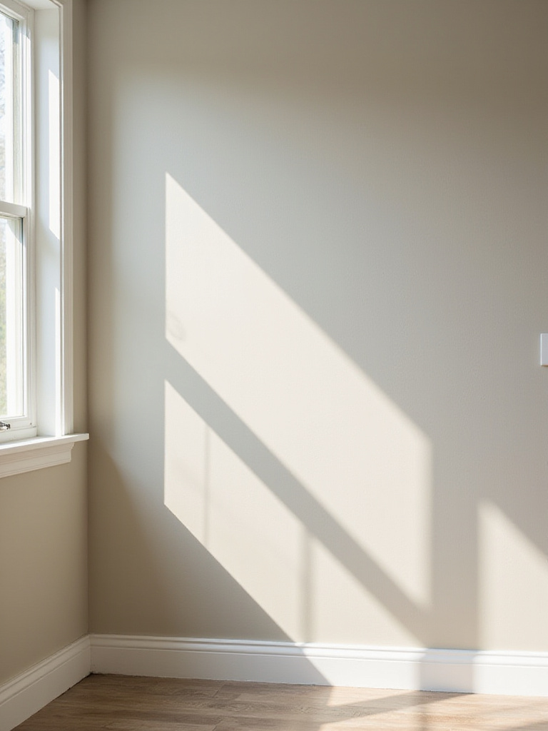
1. Assess Your Living Room’s Natural Light Direction
Understanding your living room’s natural light is the foundation of successful color selection. The direction your windows face dramatically influences how paint colors appear throughout the day, making this assessment crucial before you even consider specific hues. North-facing rooms receive cool, consistent light that can make colors appear more muted and blue-toned, while south-facing spaces are bathed in warm, intense light that can amplify color vibrancy.
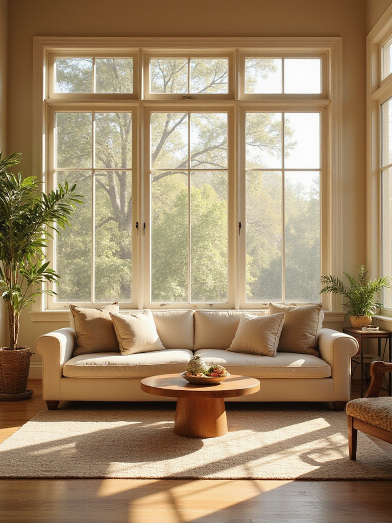
Professional stylists approach this by first mapping the light patterns in your space. Spend time in your living room at different hours – morning coffee, afternoon reading, evening relaxation – and notice how the light quality changes. East-facing rooms enjoy bright morning light but can feel dim by evening, while west-facing spaces might feel harsh in late afternoon sun. This observation period reveals how your chosen living room paint colors will perform in real-world conditions, preventing costly surprises after painting.
The magic of this piece lies in its ability to save you from expensive repainting projects. Consider testing paint samples on moveable boards so you can observe them in different lighting conditions and positions throughout your room.
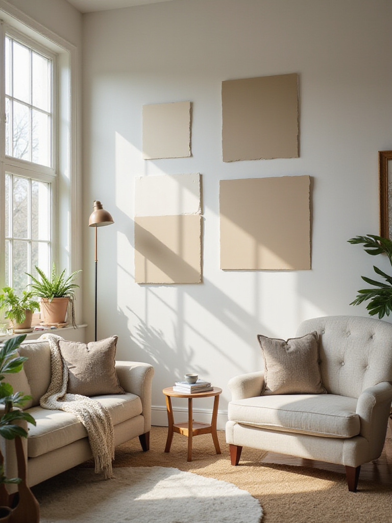
2. Identify Paint Undertones for Perfect Color Harmony
Beyond the obvious hue lies a hidden world of undertones that can make or break your color scheme. These subtle underlying colors – the hint of green in gray, the whisper of pink in beige – become apparent when paint interacts with your lighting and existing decor. Understanding undertones prevents the frustration of a “perfect” color that somehow looks wrong on your walls.
The designer’s secret here is to compare potential colors against pure white paper, which reveals undertones that might be invisible when viewing the color alone. Hold your paint samples next to your fixed elements like flooring, trim, and large furniture pieces. A warm-undertoned gray might clash beautifully with cool-toned hardwood, while a green-undertoned gray could make your space feel muddy and unbalanced.
- Warm undertones: Red, orange, yellow (create cozy, inviting feelings)
- Cool undertones: Blue, green, purple (promote calm, spacious sensations)
- Neutral undertones: True gray, balanced beige (offer maximum versatility)
What makes this design special is the way undertones interact with your room’s unique light and existing elements to create either harmony or discord.
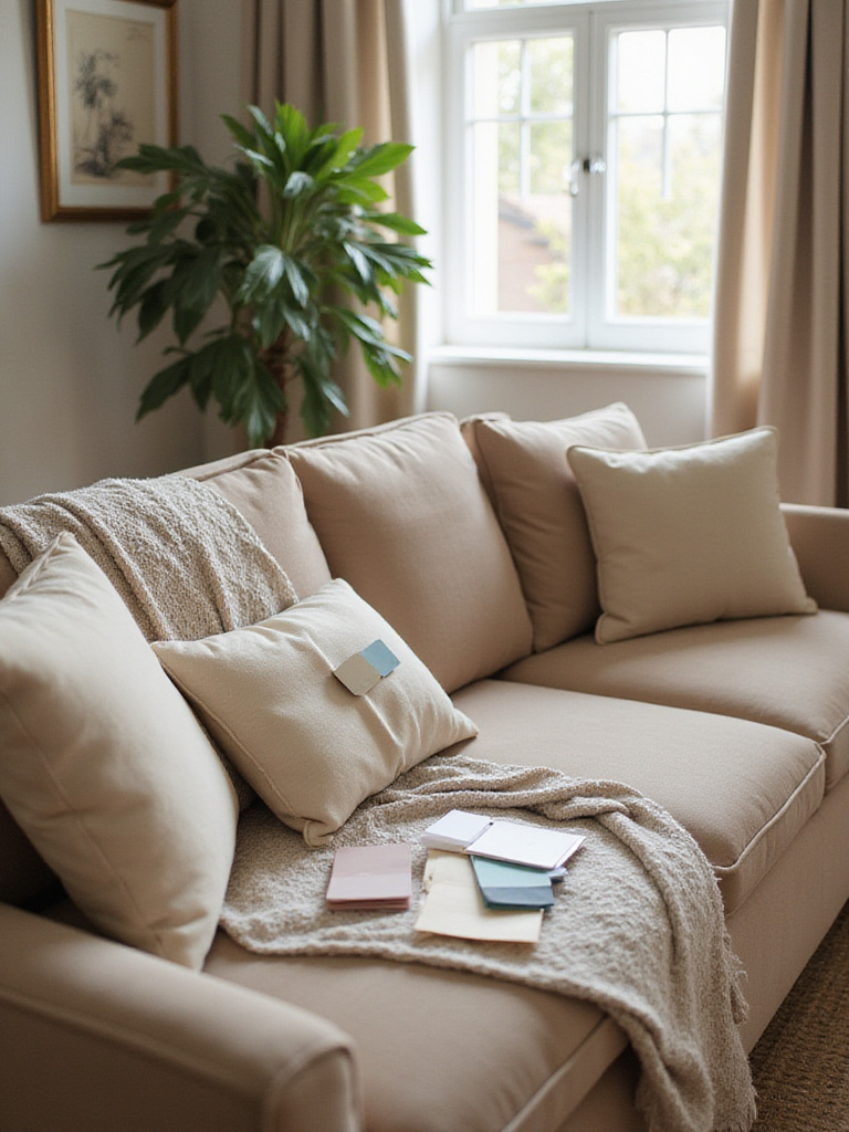
3. Test Large Paint Swatches on Multiple Walls First
Small color chips lie – it’s that simple. Testing large paint swatches, ideally at least two feet square, reveals how living room paint colors truly behave in your specific environment. This crucial step prevents the heartbreak of discovering your chosen color looks completely different once applied to entire walls.
Paint large samples on different walls within your living room, particularly ones that receive varying amounts of natural light. Live with these samples for at least 48 hours, observing how they change from morning to evening and under artificial lighting. The composition comes together when you see how the color interacts with your furniture, artwork, and daily lighting conditions rather than making decisions based on tiny swatches under fluorescent store lighting.
- Morning observation: How does the color look with natural daylight?
- Evening assessment: Does artificial lighting change the color dramatically?
- Shadow areas: How does the color appear in less-lit corners?
The unexpected pairing that always works is testing your top two color choices side by side on the same wall – you’ll immediately see which one feels right in your space.
4. Select Colors Complementing Existing Furniture & Decor
Your existing furniture isn’t a limitation; it’s your starting point for creating a cohesive design story. Rather than fighting against your current pieces, successful living room paint colors work in harmony with your sofa, rugs, artwork, and other significant elements. This approach creates an intentional, curated look while maximizing your existing investments.
Begin by identifying the dominant colors and undertones in your room’s largest elements. That sectional sofa, area rug, or statement artwork often contains a built-in color palette waiting to be enhanced. If your sofa has warm brown leather, consider paint colors with similar warm undertones. Cool-toned furniture pairs beautifully with paint colors that share those blue or green undertones.
Professional stylists approach this by creating a visual inventory of existing elements, noting both obvious colors and subtle undertones. The finishing touch that elevates the entire look comes from selecting paint that acts as a supporting player, allowing your furniture and decor to shine rather than compete for attention.
5. Determine How Room Size Impacts Your Color Choice
Room dimensions significantly influence how living room paint colors affect the space’s perceived size and atmosphere. Light colors reflect more light and can make small rooms feel larger and more open, while darker colors absorb light and can make large rooms feel more intimate and cozy. Understanding this relationship helps you choose colors that enhance rather than fight your room’s natural proportions.
In smaller living rooms, lighter shades like soft whites, pale grays, or muted pastels can create an airy, expansive feeling. However, don’t assume dark colors are off-limits in compact spaces – a rich, deep color can create a sophisticated cocoon effect that makes boundaries disappear. For larger living rooms, you have more flexibility to experiment with both light and dark hues, using color to create distinct zones or focal points.
- Small rooms: Light colors expand, monochromatic schemes blur boundaries
- Large rooms: Dark colors create intimacy, contrasting colors define zones
- Medium rooms: Most flexible, can handle both light and dark successfully
The visual weight balances perfectly when you consider your room’s natural light alongside its size – a small, bright room can handle darker colors better than a small, dim one.
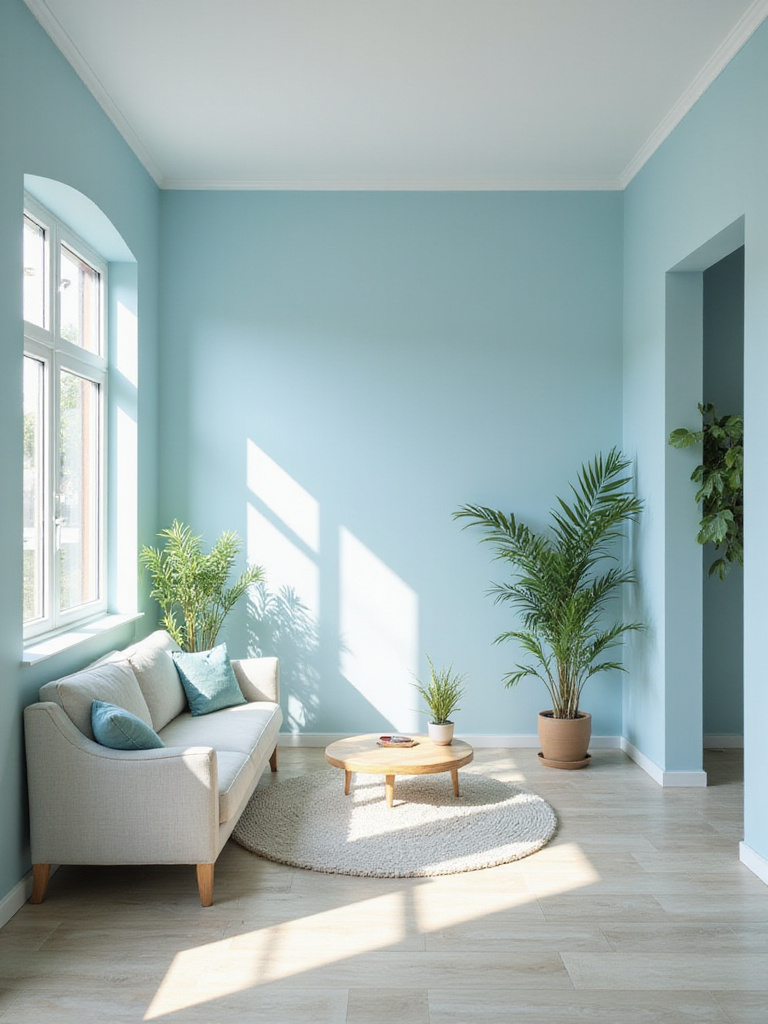
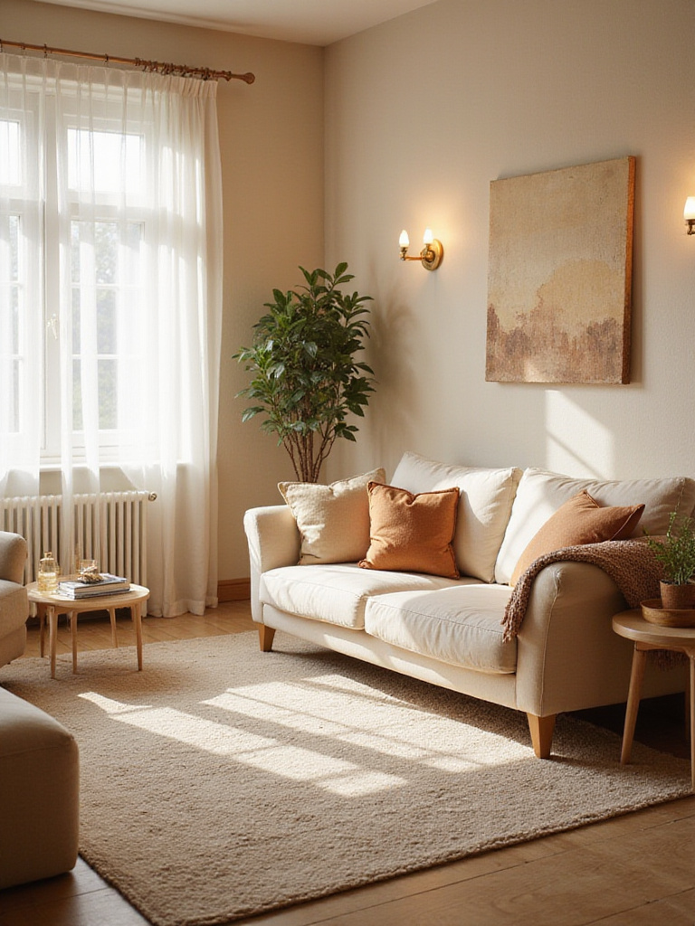
6. Embrace Calming Cool Blues for Serene Living Spaces
Cool blue paint colors transform living rooms into tranquil retreats that promote relaxation and mental clarity. From soft powder blues to deeper navy tones, these hues create a sense of spaciousness while evoking the calming qualities of sky and water. Color psychology consistently shows that blue environments can actually lower stress levels and heart rate, making them ideal for busy households seeking peace.
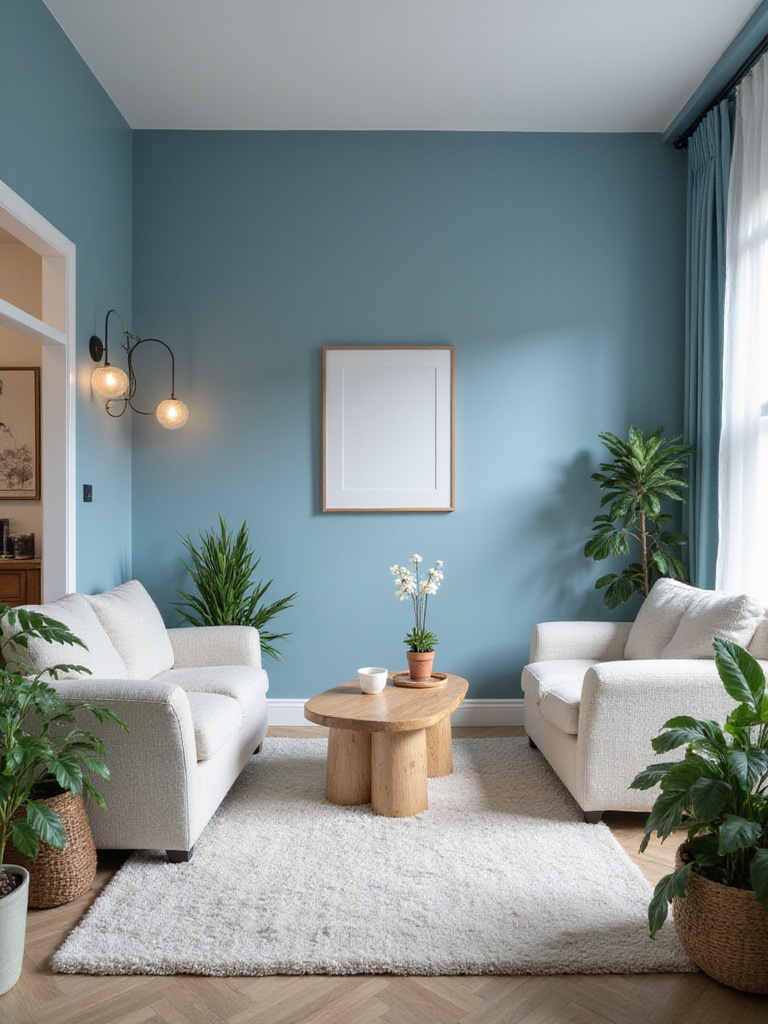
The artisan collective that creates these peaceful spaces understands that blue’s versatility extends beyond just relaxation. Lighter blues can make small living rooms feel larger and brighter, while deeper blues add sophistication and drama to larger spaces. Cool blues work particularly well in south-facing rooms where they balance intense natural light, and they pair beautifully with warm neutrals, natural wood tones, and metallic accents.
Consider how different blues serve different purposes: soft sky blue for airiness, sage blue-green for natural tranquility, or deep navy for elegant drama. The key is selecting a blue that complements your room’s undertones and existing elements.
Beyond the trends, the enduring appeal comes from blue’s ability to serve as both a neutral backdrop and a statement color, adapting to changing decor styles while maintaining its calming influence.
7. Discover Versatile Greige: The Ultimate Neutral Hue
Greige – the sophisticated blend of gray and beige – offers the perfect balance between cool and warm neutrals. This chameleon-like color adapts to its surroundings, appearing more gray with cool-toned decor and more beige with warm elements. For living room paint colors, greige provides an elegant backdrop that works with virtually any decorating style while offering more depth than plain white or beige.
The beauty of greige lies in its ability to complement both contemporary and traditional furnishings. It pairs effortlessly with bold accent colors, natural wood tones, and metallic finishes. Unlike stark grays that can feel cold or yellowy beiges that can appear dated, greige maintains a balanced, sophisticated presence that enhances rather than dominates your space.
- Warm greige: Contains subtle yellow or red undertones, feels cozy
- Cool greige: Has blue or green undertones, appears more modern
- Balanced greige: True blend without strong undertones, maximum versatility
The sustainable journey of this material involves choosing a greige that harmonizes with your existing flooring and trim, creating a cohesive foundation for your decorating adventures.
8. Bring Nature Indoors with Soothing Green Tones
Green paint colors create an instant connection to nature, promoting feelings of balance, renewal, and tranquility in your living space. From soft sage to deep forest green, these hues work with our innate biophilic tendencies, creating environments that feel both calming and energizing. Research shows that green is the most restful color for human eyes, making it an excellent choice for spaces where you spend significant time.
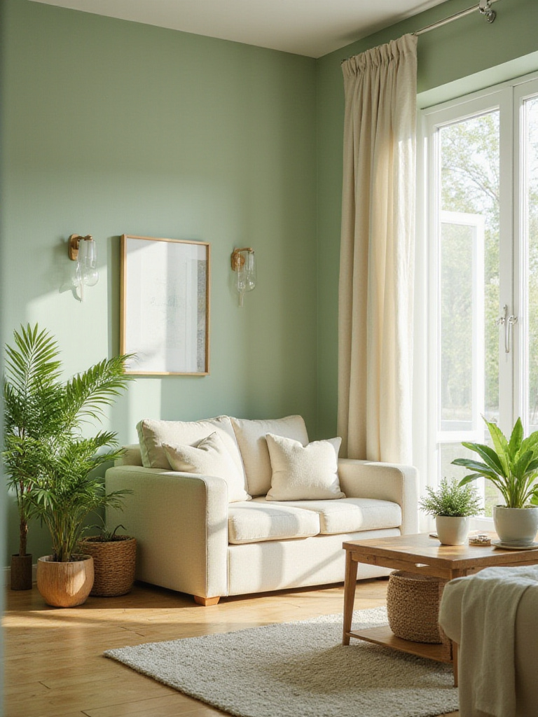
The environmental story behind this piece began with understanding how different greens serve different purposes. Soft sage greens create spa-like serenity, while deeper olive tones add sophisticated warmth. Blue-green hues feel cool and refreshing, perfect for rooms with warm natural light, while yellow-green shades bring cheerful energy to dimmer spaces.
Green living room paint colors work beautifully with natural materials like wood, stone, and linen, reinforcing the connection to nature. They also pair surprisingly well with warm metals like brass and copper, creating rich, layered looks that feel both organic and refined.
The collaboration began with a conversation about how green spaces in nature make us feel more grounded and peaceful – bringing those same qualities indoors through thoughtful paint choices.
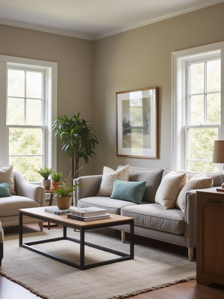
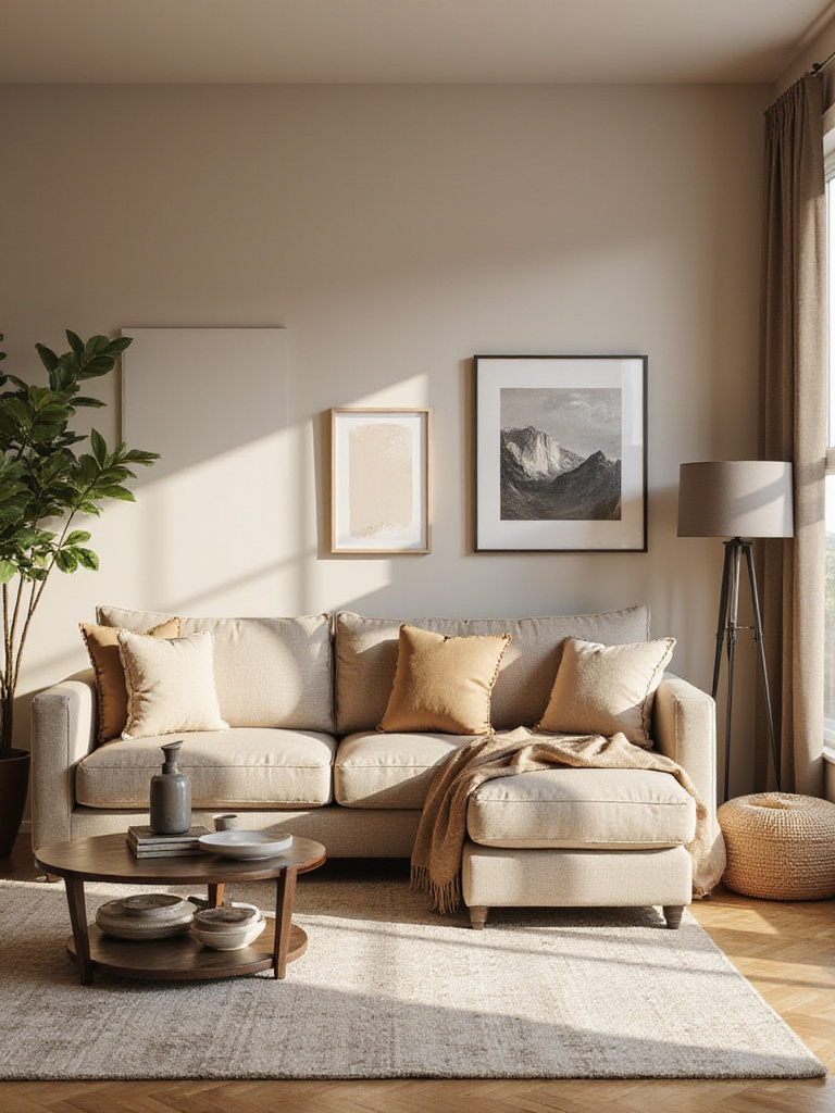
9. Warm Up Living Rooms with Inviting Earthy Shades
Earthy paint colors – think terracotta, warm taupe, ochre, and muted sage – create living rooms that feel grounded and welcoming. These nature-inspired hues promote feelings of stability and comfort while providing a sophisticated alternative to stark whites or cool grays. Earthy tones work particularly well in modern homes where they soften hard edges and add human warmth to minimalist spaces.
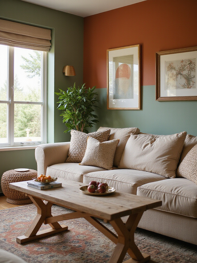
The craftsmanship reveals itself in details like how earthy colors interact with natural light throughout the day. Terracotta walls glow warmly in morning sun and create cozy intimacy in evening lamplight. Warm taupe provides a neutral backdrop that makes artwork and furniture pop while maintaining a sense of groundedness that pure white cannot achieve.
These colors pair beautifully with Natural textures like jute rugs, linen upholstery, and Reclaimed Wood furniture. They also complement both warm and cool accent colors, making them versatile choices for evolving decorating styles.
The maker’s journey from apprentice to master influenced how we understand that earthy living room paint colors connect us to our fundamental need for natural, comforting environments.
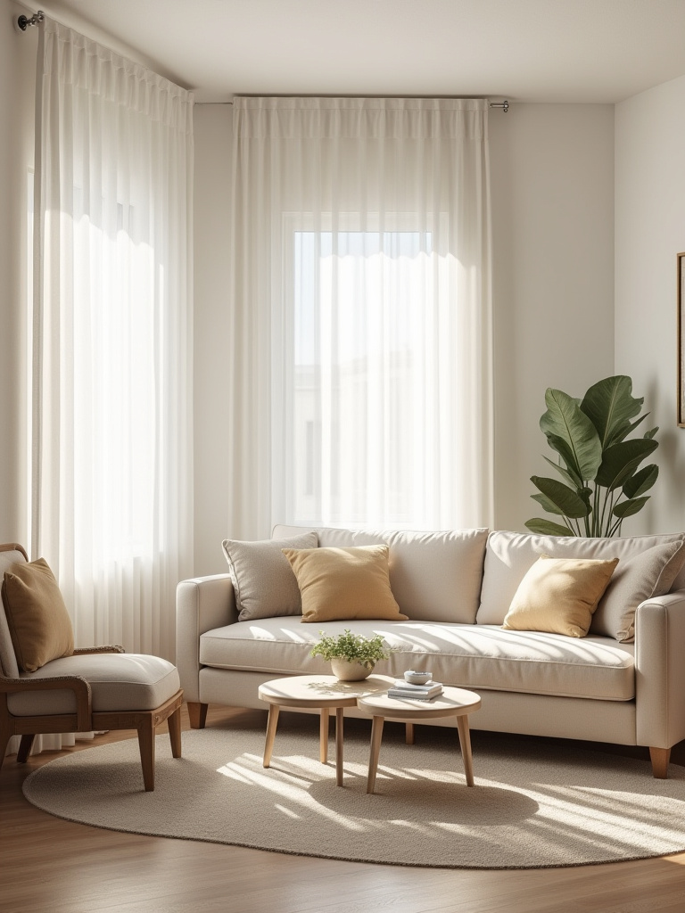
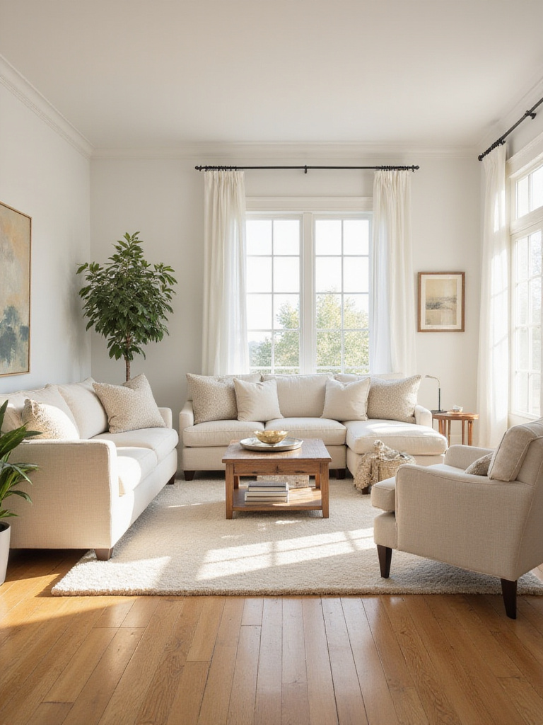
10. Master Crisp White for a Timeless, Airy Feel
White paint remains the ultimate versatile choice for living rooms, offering a fresh, timeless backdrop that maximizes light and creates a sense of spaciousness. However, not all whites are created equal – the key lies in selecting the right white with undertones that complement your room’s natural light and existing elements. The right white can make a small room feel expansive or provide a gallery-like backdrop for colorful furnishings and artwork.
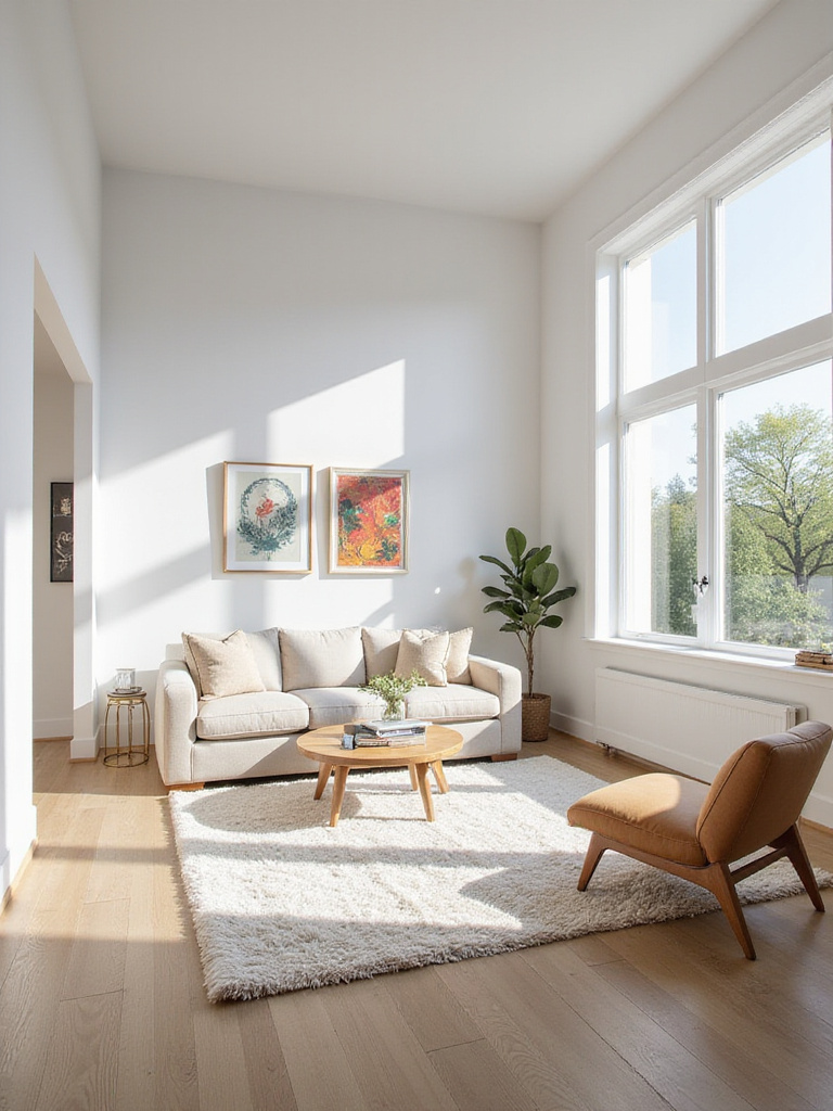
The design language evolved from traditional patterns that recognized white’s power to reflect up to 80% of available light, dramatically brightening spaces. Cool whites work well in south-facing rooms with warm natural light, while warm whites prevent north-facing rooms from feeling stark. Consider your room’s fixed elements – flooring, trim, and large furniture – when selecting white undertones to ensure harmony rather than clashing.
- Warm whites: Cream, ivory, or yellow undertones create coziness
- Cool whites: Blue or gray undertones feel crisp and modern
- True whites: Minimal undertones offer maximum flexibility
The heritage technique gets a contemporary update through understanding how different sheens affect white’s performance – eggshell for walls, semi-gloss for trim, and flat for ceilings create subtle depth without introducing color.
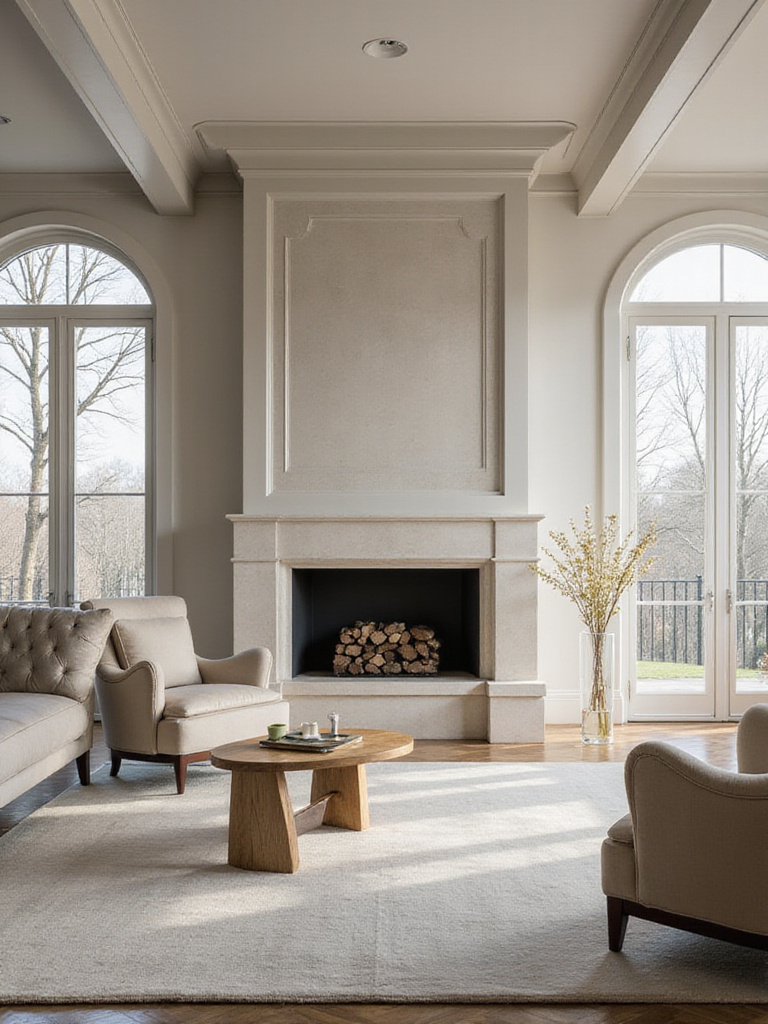
11. Explore Sophisticated Dark Hues for Dramatic Impact
Dark living room paint colors create sophisticated, intimate spaces that feel luxurious and intentional. Contrary to common belief, dark colors can actually make rooms feel larger by creating depth and making boundaries less defined. Deep blues, charcoal grays, rich greens, and even black can transform ordinary living rooms into dramatic, high-end spaces that feel like designer showrooms.
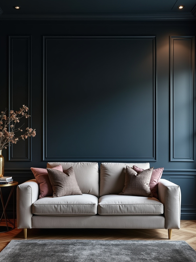
The key to success with dark colors lies in balancing them with lighter elements and ensuring adequate lighting. Dark walls provide a stunning backdrop for light-colored furniture, metallic accents, and artwork. They also hide imperfections better than light colors and create a cozy, cocoon-like atmosphere perfect for evening relaxation and entertaining.
Dark hues work particularly well in larger living rooms or spaces with abundant natural light. They can also create striking accent walls that define seating areas or highlight architectural features like fireplaces or built-in shelving.
The quality becomes evident after years of use when dark colors maintain their sophistication and continue to make everything placed against them look more expensive and intentional.
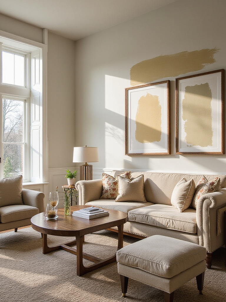
12. Add Personality with Subtle Pastel Accent Colors
Subtle pastel accents offer a gentle way to inject personality into living room paint colors without overwhelming the space. These soft, muted hues – think dusty rose, sage green, or powder blue – can be introduced through accent walls, built-in shelving, or architectural details to create visual interest while maintaining a sophisticated, calming atmosphere.
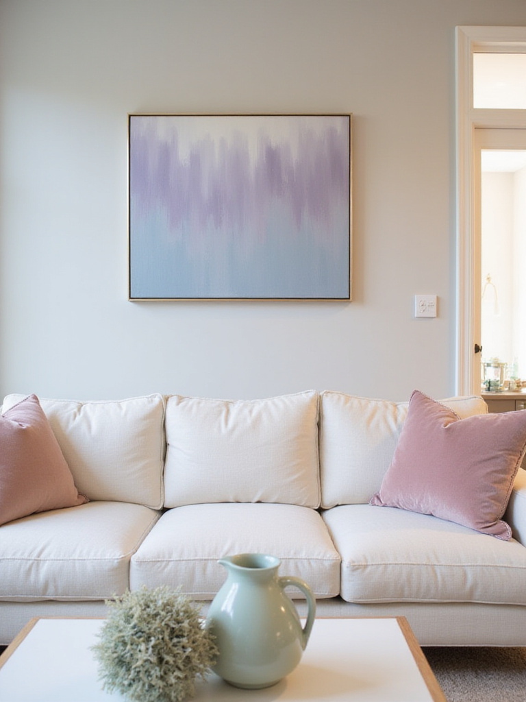
The beauty of pastels lies in their versatility and timeless appeal. Unlike bold, saturated colors that might feel dated quickly, soft pastels have an enduring quality that works with changing decor trends. They’re particularly effective in rooms with abundant natural light, where they can provide subtle color without competing with bright furnishings or artwork.
- Blush pink: Adds warmth without being overwhelming
- Sage green: Brings natural tranquility and sophistication
- Powder blue: Creates airiness and calm
Pastels work beautifully in monochromatic schemes where different tints and shades of the same color family create depth and interest. They also pair well with crisp whites and warm neutrals for a fresh, contemporary look.
The evolution of this trend reflects broader cultural shifts toward creating calming, nurturing home environments that support well-being and relaxation.
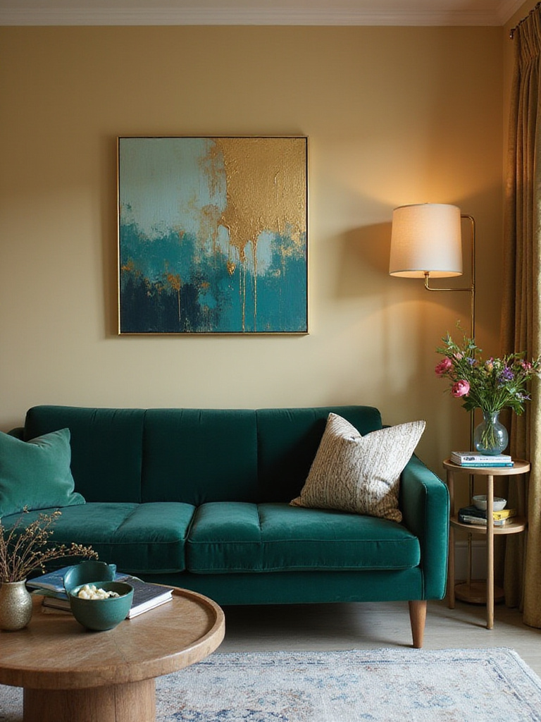
13. Consider Bold Jewel Tones for Luxurious Statements
Bold jewel tones – emerald green, sapphire blue, amethyst purple, and ruby red – bring instant luxury and sophistication to living rooms. These rich, saturated colors create depth and drama while serving as stunning backdrops for both contemporary and traditional furnishings. When used thoughtfully, jewel tones can make a living room feel like an expensive, custom-designed space.
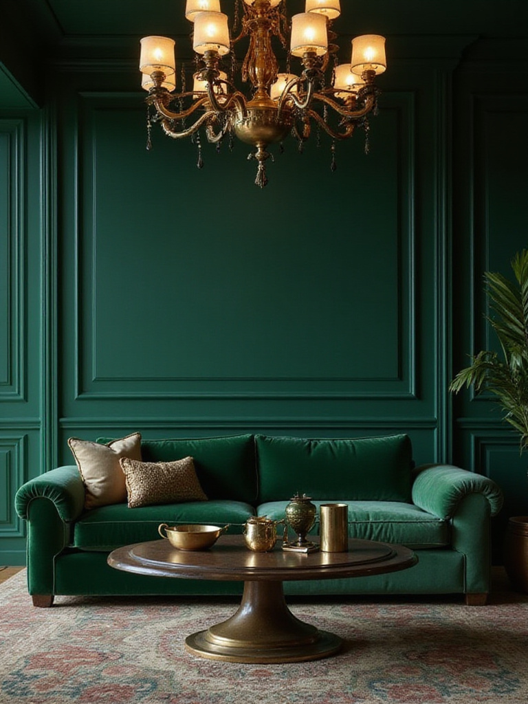
The secret to successfully incorporating jewel tones lies in balance and lighting. These colors work best when paired with neutral elements and adequate lighting to prevent the space from feeling too dark or overwhelming. Consider using jewel tones on a single accent wall or in built-in cabinetry rather than covering every surface.
Jewel tones complement metallic accents beautifully – gold with emerald, silver with sapphire, or copper with deep purple. They also work well with rich textures like velvet, silk, and polished wood, enhancing the luxurious feeling these colors naturally create.
The investment value comes from the exceptional sophistication jewel tones bring to a space, creating rooms that feel both timeless and distinctly personal.
14. Create Flow with Cohesive Open-Concept Color Palettes
Open-concept living spaces require thoughtful color coordination to create visual flow between different functional areas. Rather than treating each zone as a separate room, successful living room paint colors in open floor plans use a cohesive palette that unifies the space while allowing for subtle distinctions between areas. This approach makes smaller open spaces feel larger and more organized.
The strategy involves selecting a primary neutral color for the majority of wall space, then introducing complementary colors through furniture, accessories, and accent walls to define different zones. For example, a light gray might serve as the base color throughout, with warm wood tones defining the dining area and cool blue accents highlighting the living space.
Successful open-concept color schemes follow the 60-30-10 rule: 60% dominant neutral, 30% secondary color, and 10% accent color. This creates visual hierarchy while maintaining cohesion across the entire space.
The forecast for next season already hints at increased preference for seamless, flowing color schemes that support the way people actually live in open-concept homes.
15. Strategically Use Accent Walls to Define Zones
Accent walls serve as powerful tools for defining spaces within open-concept living rooms without physical barriers. A strategically painted wall can create intimacy around a seating area, highlight a dining zone, or showcase architectural features like fireplaces. The key lies in selecting the right wall and color to achieve your desired effect without disrupting the room’s overall flow.
The most effective accent walls typically sit behind major furniture pieces – the sofa, dining table, or entertainment center. This creates a natural backdrop that defines the zone while providing visual weight and interest. Choose colors that complement rather than clash with your main wall color, using either deeper shades of the same hue or complementary colors from your overall palette.
- Behind seating: Creates cozy conversation areas
- Dining zones: Defines eating spaces in open floor plans
- Architectural features: Highlights fireplaces or built-ins
Consider texture as well as color – an accent wall with subtle texture or a different finish can define space even when using the same color as surrounding walls.
The styling mistake most people make is choosing accent wall colors that are too bold or disconnected from the room’s overall palette, creating jarring interruptions rather than thoughtful definitions.
16. Choose Paint Finishes for Desired Durability & Sheen
Paint finish selection impacts both the aesthetic and practical performance of your living room paint colors. Different sheens offer varying levels of durability, cleanability, and light reflection, making finish choice crucial for achieving your desired look while meeting your lifestyle needs. Understanding these differences helps you make informed decisions that balance beauty with functionality.
Flat or matte finishes hide imperfections well and create a sophisticated, non-reflective surface, but they’re less durable and harder to clean. Eggshell and satin finishes offer the best balance for most living rooms – they provide subtle sheen that reflects light gently while offering good durability and cleanability. Semi-gloss works well for trim and high-traffic areas but can highlight wall imperfections.
- Flat/Matte: Hides imperfections, sophisticated look, lower durability
- Eggshell/Satin: Balanced sheen and durability, most popular choice
- Semi-gloss: High durability, good for trim and accents
Consider your lifestyle when selecting finishes. Households with children or pets benefit from more durable, washable finishes, while formal living rooms might prioritize the elegant appearance of lower-sheen options.
The traditional methods used result in finishes that not only look beautiful when first applied but maintain their appearance through years of daily living.
17. Harmonize Trim and Ceiling Colors with Walls
Creating harmony between walls, trim, and ceiling colors elevates living room paint colors from amateur to professional-looking results. Rather than defaulting to stark white trim and ceilings, consider how subtle color coordination can create sophisticated, cohesive spaces that feel intentionally designed. This approach can make rooms feel larger, more intimate, or more architecturally interesting depending on your color choices.
Monochromatic schemes using different shades of the same color family create seamless, sophisticated looks. For example, if your walls are a medium gray, consider a lighter tint for the ceiling and either the same gray or a slightly deeper shade for trim. This creates depth without harsh contrasts that can make spaces feel choppy.
Alternatively, painting trim in a complementary color can highlight architectural details and add visual interest. The key is ensuring all colors share similar undertones to maintain harmony.
The cultural heritage preserved in each piece includes understanding how traditional color relationships create rooms that feel balanced and professionally designed rather than haphazardly painted.
18. Balance Warm and Cool Colors for Optimal Comfort
Successful living rooms incorporate both warm and cool color elements to create spaces that feel complete and comfortable. Pure warm or cool schemes can feel one-dimensional, while balanced palettes offer visual interest and psychological comfort. Understanding how to blend these temperature families helps create living room paint colors schemes that feel both dynamic and harmonious.
If your walls lean cool (grays, blues, greens), introduce warmth through wood furniture, brass accents, or warm-toned textiles. Conversely, warm wall colors benefit from cool elements like silver metals, blue accents, or stone materials. This balance prevents rooms from feeling either too sterile or too overwhelming.
- Cool dominance: Add warm wood, brass, or earth-toned accents
- Warm dominance: Introduce cool metals, blues, or stone elements
- Balanced approach: Mix warm and cool elements throughout
The interplay between the colors creates visual depth and emotional comfort, making spaces feel more livable and less like showrooms.
The emotional response this evokes begins with understanding how color temperature affects our psychological comfort and sense of well-being in our most important living spaces.
19. Brighten Small Living Rooms Using Lighter Shades
Light living room paint colors are essential tools for maximizing the perceived size and brightness of compact spaces. Colors with high Light Reflectance Values (LRV) bounce more light around the room, creating an airy, open feeling that makes small living rooms feel significantly larger. However, “light” doesn’t necessarily mean stark white – many soft, muted colors can achieve similar effects while adding more personality.
Pale grays, soft blues, creamy whites, and muted pastels all reflect substantial amounts of light while providing more visual interest than pure white. The key is selecting colors with LRV ratings above 70, which reflect enough light to create the desired spacious feeling.
Consider extending light colors to the ceiling and trim to blur boundaries and create seamless visual flow. This technique eliminates visual stops that can make small rooms feel choppy or confined.
The unexpected environmental benefit comes from reduced need for artificial lighting during daylight hours, as light-colored walls maximize natural light effectiveness.
20. Make North-Facing Rooms Feel Warmer with Color
North-facing living rooms receive cool, indirect light that can make spaces feel dim and unwelcoming. Strategic living room paint colors with warm undertones can counteract this cool light, creating more inviting and comfortable environments. The key lies in selecting colors that add warmth without making the space feel dark or cramped.
Warm whites, creamy beiges, soft yellows, and peachy tones all help counteract the blue-toned light common in north-facing rooms. These colors reflect the available light while adding warmth that makes the space feel more comfortable and lived-in. Avoid colors with cool undertones, which can be amplified by the room’s natural light and make the space feel even cooler.
Consider the room’s purpose when selecting warm colors – soft, muted tones for relaxation or slightly more saturated colors for energy and conversation.
The ambiance evolves throughout the day as natural light changes, but warm paint colors provide consistent comfort regardless of weather or season.
21. Select Colors That Enhance Architectural Features
Thoughtfully chosen living room paint colors can highlight and enhance your room’s architectural features, turning ordinary elements into design focal points. Crown molding, built-in shelving, fireplaces, and other architectural details become more prominent when painted in colors that either contrast with or complement the wall color.
Consider painting architectural trim in a deeper shade of your wall color to create subtle definition, or use contrasting colors to make features pop. White trim against colored walls creates classic contrast, while monochromatic schemes in different sheens offer sophisticated subtlety.
- Contrast approach: Different colors highlight architectural details
- Monochromatic approach: Same color family in different shades or sheens
- Accent approach: Bold color on specific architectural elements
Built-in bookshelves painted in accent colors become focal points, while mantels highlighted with contrasting paint draw attention to fireplace areas.
The construction technique that ensures longevity involves selecting colors that enhance rather than fight your room’s existing architectural character.
22. Coordinate Paint with Flooring and Textiles for Unity
Successful living room paint colors work in harmony with existing flooring and major textiles to create cohesive, professionally designed spaces. Your flooring often represents the largest single color element in the room, making it crucial to consider when selecting wall colors. Similarly, large furniture pieces and area rugs contribute significantly to your room’s color story.
Identify the undertones in your flooring – warm honey oak, cool gray laminate, or neutral stone tile – and select paint colors that complement rather than clash with these undertones. If your flooring has warm undertones, cool paint colors can create pleasing contrast, while similar undertones create harmonious, flowing looks.
Large textiles like sofas and area rugs should also influence paint selection. Use these pieces as inspiration for your color palette rather than obstacles to work around.
The discovery of this technique happened when designers realized that rooms feel most successful when all major elements share some color relationship, creating visual threads that tie the space together.
23. Avoid Common Paint Color Selection Mistakes
Understanding common pitfalls helps ensure your living room paint colors achieve the desired results without costly do-overs. The most frequent mistakes include selecting colors from tiny chips, ignoring undertones, failing to test in actual lighting conditions, and choosing colors that clash with existing elements.
Small paint chips under fluorescent store lighting bear little resemblance to how colors appear on your walls under natural and artificial light. Always test large samples in your actual space for at least 48 hours before committing. Pay attention to how colors change throughout the day and under different lighting conditions.
- Chip selection: Small samples don’t represent real-world appearance
- Undertone ignorance: Hidden color bias affects overall harmony
- Light neglect: Colors change dramatically under different lighting
- Element clashing: Paint must work with existing flooring and furniture
Another common mistake involves selecting trendy colors without considering longevity or personal preference, leading to regret as trends change.
The sustainable innovation narrative includes choosing colors you genuinely love rather than following temporary trends that may quickly feel dated.
24. Plan for Future Decor Changes with Adaptable Hues
Selecting adaptable living room paint colors provides flexibility for future decorating changes without requiring complete repainting. Versatile neutrals and timeless colors serve as excellent backdrops for evolving furniture, artwork, and accessories, allowing you to refresh your space without major renovation expenses.
Consider how your color choice will work with different decorating styles and seasonal changes. Neutral bases like warm grays, soft whites, and balanced beiges adapt to both contemporary and traditional furnishings while accommodating bold or subtle accent colors as your preferences evolve.
Think long-term when making paint decisions – will this color work if you change your sofa, add new artwork, or shift your decorating style? Adaptable colors provide the foundation for multiple decorating iterations without requiring wall color changes.
The renewal process reflects how thoughtful initial color selection supports years of decorating evolution, making your paint investment work harder and longer for your changing lifestyle needs.
Conclusion
Selecting the perfect living room paint colors involves much more than simply choosing a shade you find appealing. It requires understanding how natural light affects color perception, recognizing undertones, testing extensively in your actual space, and coordinating with existing elements to create truly harmonious results. These 24 expert tips provide the foundation for making confident color decisions that enhance your daily living experience.
Remember that your living room serves as the heart of your home – a space for relaxation, entertainment, and connection with family and friends. The colors you choose should support these activities while reflecting your personal style and creating the atmosphere you desire. Whether you prefer the timeless elegance of crisp whites, the drama of bold jewel tones, or the versatility of sophisticated neutrals, the key lies in thoughtful selection and proper implementation.
Take time to observe your space, test your options thoroughly, and consider both immediate impact and long-term satisfaction. With these expert insights guiding your decisions, you’re well-equipped to create a living room that not only looks beautiful but truly feels like home. Your perfect living room paint colors await – trust the process, and enjoy the transformation.